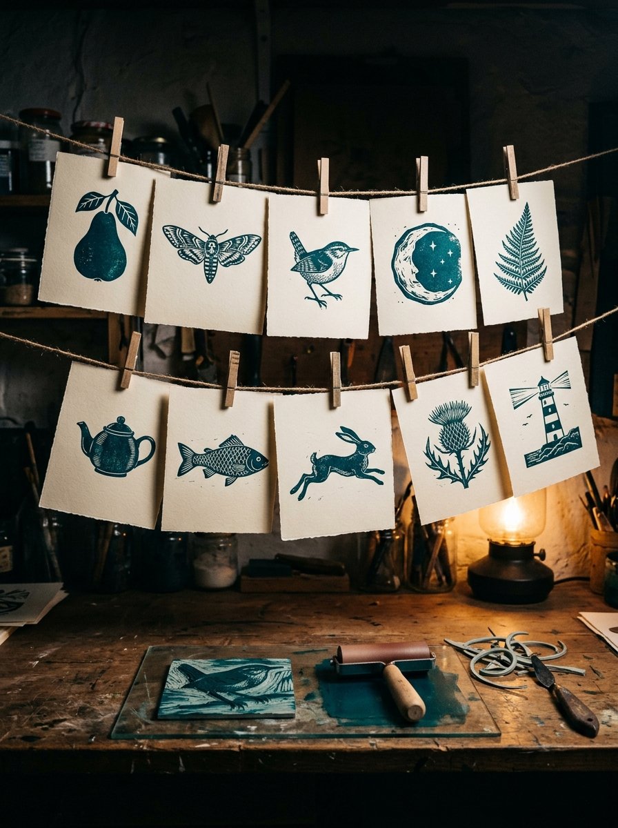
Sybil Andrews cut Golgotha out of a sheet of lino in 1931 and the V&A still has it. Most lino print ideas for beginners start with the same unglamorous material and a soft pencil.
Lay the paper face down on the lino. Draw over your lines with a ballpoint. The design lifts across on its own.
It comes across backwards. Everything you cut prints in mirror. That fact catches out every beginner. It is also why a lino print looks bolder than the drawing it came from.
So you are not really drawing on lino. You are deciding what to keep. (I found that a relief. Deciding is easier than drawing.)
Below: 109 designs, a build for one of them, and the 2 faults that spoil a print.
Download the carve-ready line sheet →
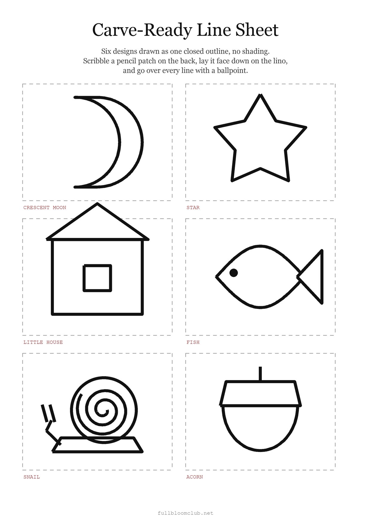
Print it at actual size. If the printer offers to fit it to the page, refuse it. A design that shrinks gets thin, and thin is the one thing lino will not hold.
Each shape on the sheet is drawn as one closed outline. No shading, no hatching, no clever little marks. That is not me being lazy on your behalf. It is the shape of a design that survives a blade.
I cut a fern from a lovely detailed drawing once. The fronds came out as 14 grey smudges. The same fern, redrawn fat, printed beautifully on the first pull.
The 6 on the sheet are the ones I would hand a nervous person. A moon is 2 curves. A star is 5 straight cuts. A house is a square wearing a triangle.
Not one of them needs a steady hand. They need a decision about where the black stops. That is a different skill, and a far easier one to practise.
The hard part was never the cutting. The hard part is finding a design that is already drawn as one clean bold line.
The Collection
Where does the next bold line come from when the free sheet runs out?
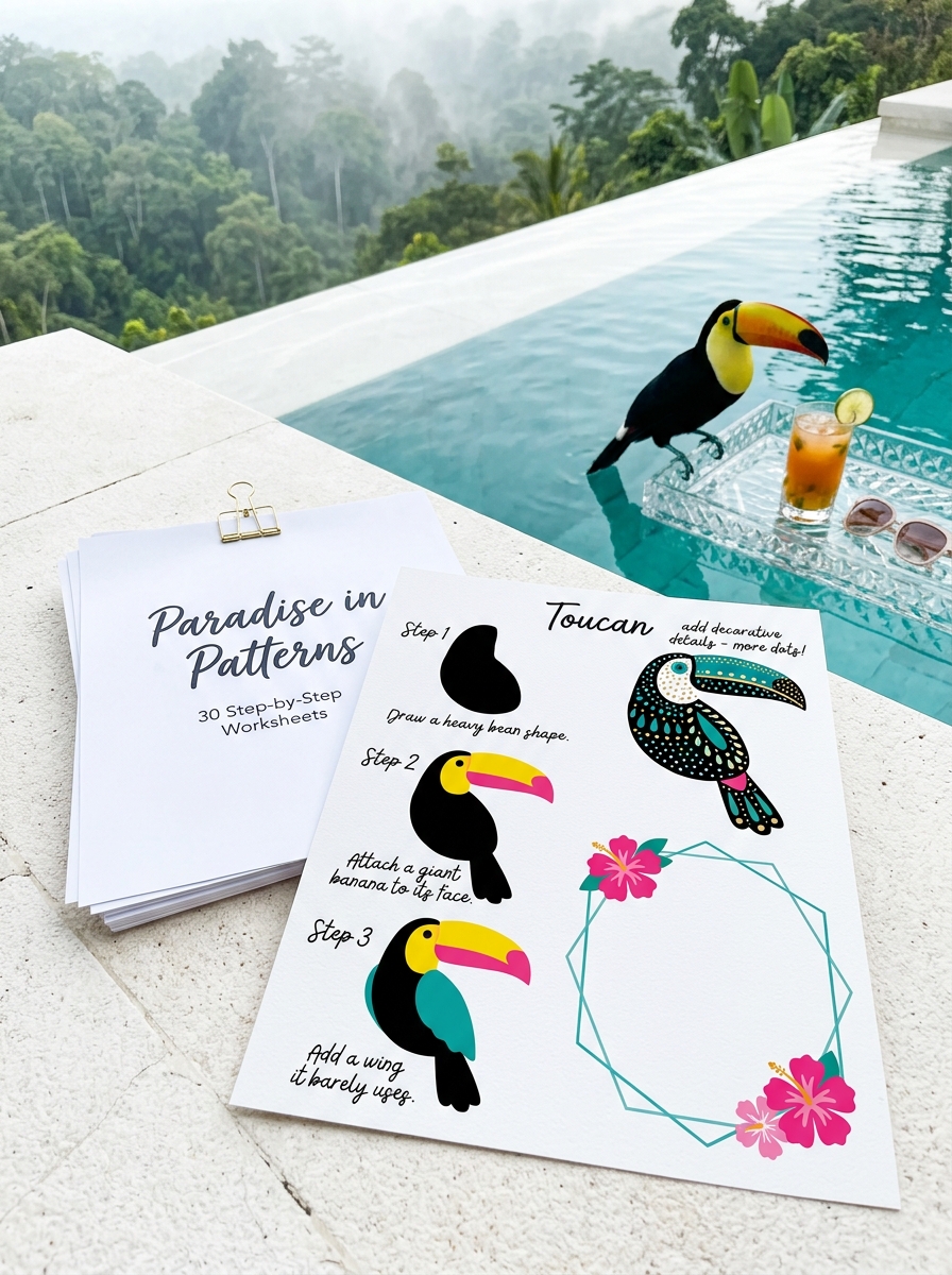
PARADISE IN PATTERNS. Macaws, hoopoes, and a sloth in no hurry. For the evening you want a design already drawn fat enough to cut. Inside: 32 folio sheets, 22 of them birds, every one a bold closed outline. (The cassowary is in there. It has the expression of a bird that knows it could take you.) What you get: a line that survives a blade, and 32 of them.
So: pick your shape, and we will take one of them all the way to a printed sheet of paper.
Step 1 — Most lino print ideas for beginners are one bold shape
Pick a design with one clear outline and no shading. Trace it, or draw it fat and simple.
You will see a shape that looks almost too plain on paper. Good. Lino thickens nothing and thins everything.
If it looks wrong, your lines are too close together. Anything under about 3mm apart will tear out and print as one blob.
A pear. A fig. A single plum with its stalk still on. A mushroom cap. An acorn. A pine cone. A leaf, any leaf at all. Those 7 are the softest possible landing, because every one of them is a closed curve with nothing inside it.
A crescent moon. A round moon. A star with 5 fat points. A heart. A hand. A key. A little house with one window. Cut the window last. Cut it first and you will have nowhere to put the walls.
A fish. A whale. A snail. A bee. A moth with its wings out flat. The moth beats the butterfly here, and I say that as someone who tried the butterfly twice. Flat wings hold ink. Folded wings need shading, and shading is 40 tiny cuts you do not want yet.
A hen. A duck. A wren on a twig. An owl, face on. Birds go wrong at the beak every time. Cut the body, print it, and add the beak after you have seen how big it really wants to be.
A cat curled into a circle. A cat standing up. A dog’s head in profile. A teapot. A cup. A jug. A bowl of 3 eggs.
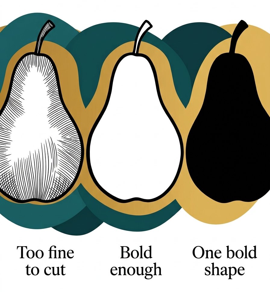
That is 30 designs, and every one of them is a single silhouette.
Step 2 — Get the drawing onto the lino, backwards
Scribble the pencil patch. Lay the drawing face down. Go over every line with a ballpoint, pressing hard.
You will see a faint grey version of your design on the lino, reversed. Go over it again with a marker so you can actually see it while you cut.
If it looks wrong, you have skipped the reversing and your design is the right way round. Print it and it will come out backwards.
This only matters for letters, numbers and anything with a hand in it. A pear does not care. (Neither, it turns out, does a moth.)
I now write a small R in the corner of every block. When the proof comes out with the R the right way round, I know I have done it correctly.
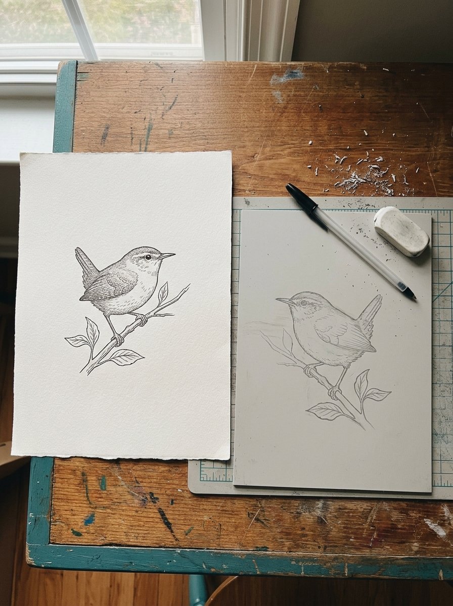
You are not drawing on lino. You are deciding what to keep.
Step 3 — Most lino print ideas for beginners go wrong in the background, so cut the outline first
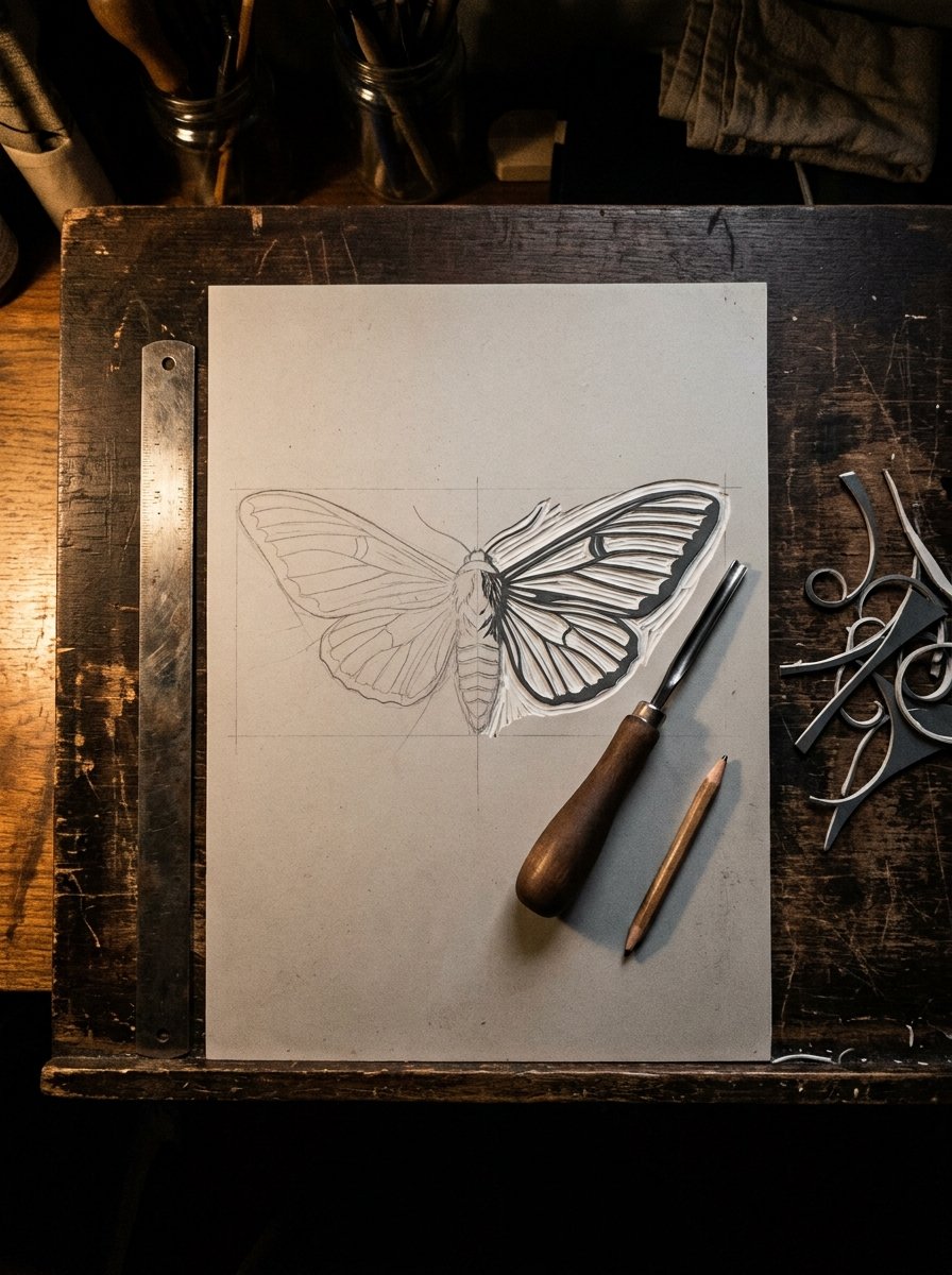
Cut a shallow line just outside your whole outline. Go all the way round before you clear anything.
You will see your shape fenced in by a thin channel. That channel is a wall. Your blade will skid into it and stop, instead of skidding into the middle of your pear.
If it looks wrong, you are cutting towards your hand. Turn the block, not the blade, and keep the blade going away from the hand that is not holding it.
Then clear the background in long sweeps, not little nibbles. Nibbles leave ridges, and ridges take ink.
I clear the far corners first, while my hand is steady. The fiddly bit near the outline goes last. It took me a dozen blocks to work that out. Nothing else improved my prints as much.
Step 4 — Ink it thin, and ink it twice
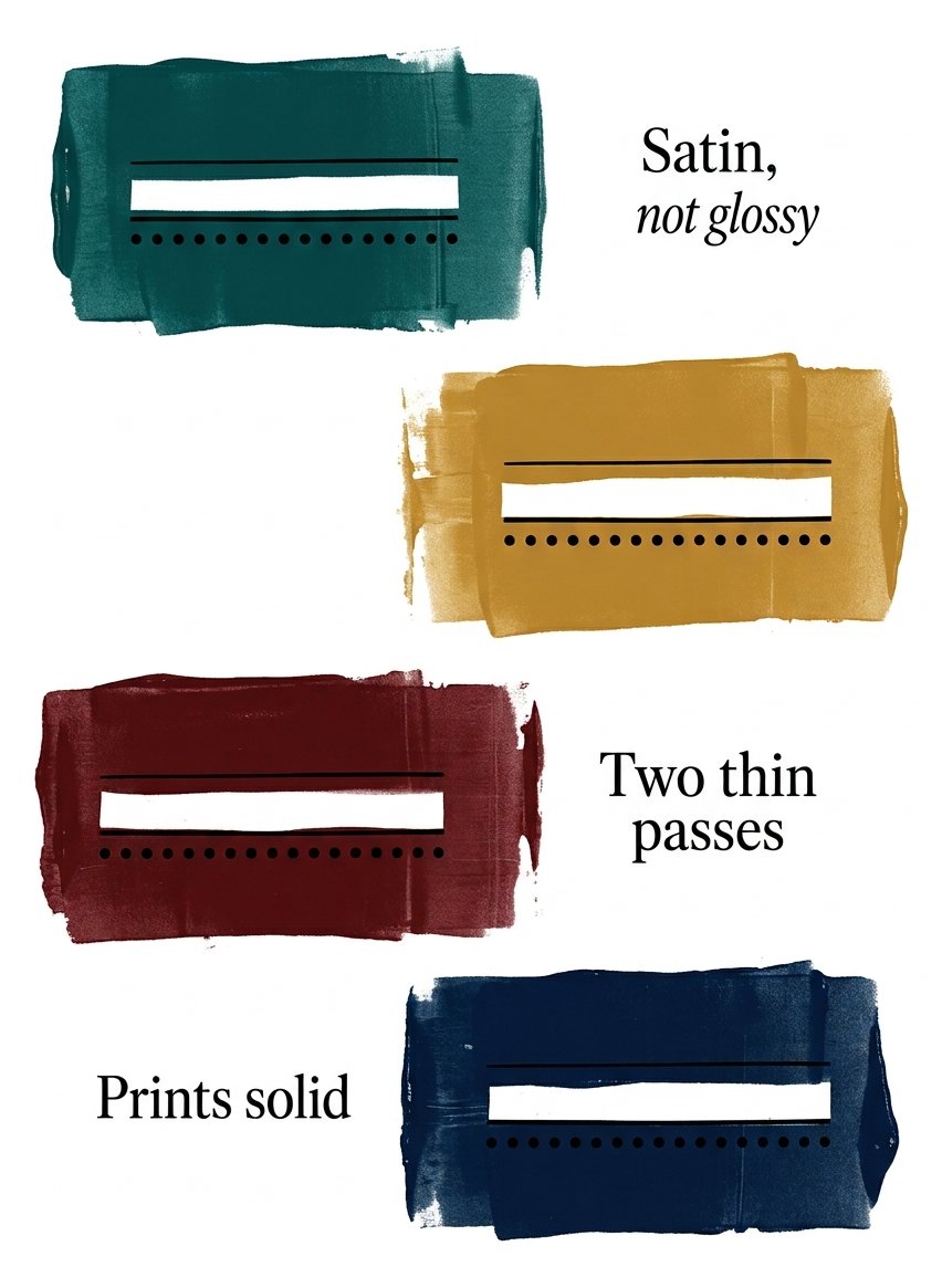
Squeeze out a strip of ink the length of your thumb. Roll it flat until the roller hisses.
You will see the block go satin, not glossy. Satin is right. Glossy means too much ink, and too much ink fills in every line you cut.
If it looks wrong and the ink sits in beads, the layer is too thick. Roll the excess off onto a spare sheet and go again.
Two thin passes beat one thick one. (This is true of nail varnish, floor paint and, I am told, gravy.)
A sprig of rosemary. A thistle. A poppy head. A teasel. A fern frond. A ginkgo leaf. An oak leaf. An ivy trail. These 8 all print well because they are mostly gaps.
A dandelion clock. A daisy. A tulip. A single iris. A lemon. A bunch of grapes. A sprig of cherries. Cut the stalk thicker than looks right. Stalks are the first thing to snap off a block.
Step 5 — Most lino print ideas for beginners are printed with a spoon, not a press
Lay your paper on the inked block. Hold it still with one hand. Rub the back of the paper with a spoon, in circles, until the whole shape has been gone over twice.
You will see the ink come through the paper slightly. That is how you know where you have rubbed and where you have not.
If it looks wrong and patchy, it is supposed to be. The first proof is always patchy. It is a reading, not a result.
This is the step where people decide they are not good at this. It is also the step with the least reason for it.
Sybil Andrews cut her blocks out of ordinary household linoleum. She made her gouges from umbrella ribs. She printed by rubbing the back of the paper with a wooden spoon. No press.
Her Golgotha is a colour linocut from 1931, and it is in the V&A. The record notes the colours overlap so thoroughly that nobody can count them.
Umbrella ribs. I think about that a lot when I am being precious about equipment.
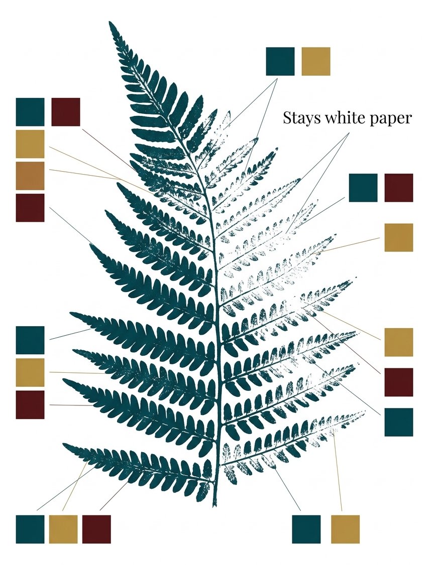
The first proof is always patchy. It is a reading, not a result.
Step 6 — Read the proof, then cut again
Look at the proof, not at the block. Mark the bits you want gone with a pen, directly on the print.
You will see 2 or 3 obvious faults, and they are nearly always in the background rather than the design.
If it looks wrong all over, the fault is ink, not cutting. Re-ink and pull another before you cut a single thing more. (My marked-up proofs look like a teacher got to them. That is the correct look.)
A tree in winter. A tree in leaf. A row of 3 firs. A hill with a path over it. A field with 5 furrows. A single cloud. A lighthouse. A boat with one sail. A gull. A wave curling over. A window with a plant on the sill. A door with a number on it. A garden gate.
Those 13 are the ones where the background does the work, so read those proofs hardest. The sky is the drawing. The tree is just the hole in it.
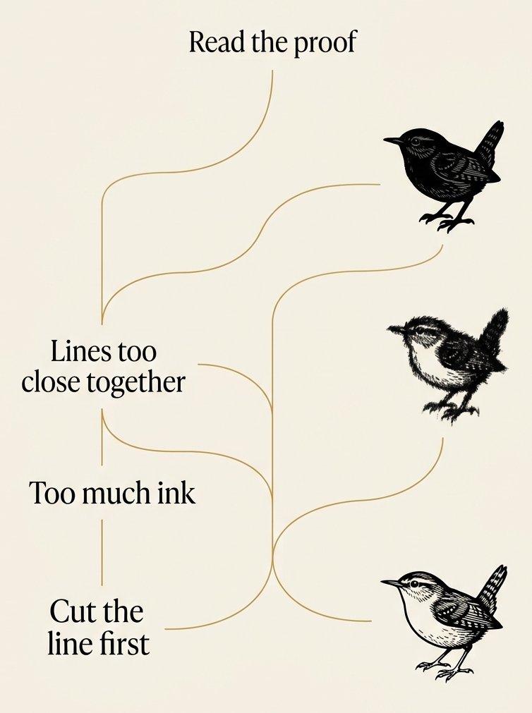
Step 7 — Then change the colour, not the drawing
Print the same block again in a different colour. Then print it a third time, slightly off, so 2 colours overlap.
You will see a new shade where they cross. That overlap is the whole trick, and it costs you nothing but a second sheet.
If it looks wrong and muddy, your 2 colours are fighting. Keep one of them pale.
Claude Flight taught lino cutting at the Grosvenor School of Modern Art from 1926. He championed printing from a few separate blocks, without the traditional keyblock of dark outlines. No outline at all. The shapes of colour do the structure themselves.
His own Speed, from about 1922, is in the V&A. It was the frontispiece of the handbook he published in 1927. (I have tried it both ways. The one without the outline is the one people pick up.)
A checkerboard. A row of triangles. A scallop border. A run of chevrons. Dots in rows. Dashes in rows. A basket weave. A brick pattern. A sunburst. A rainbow arc. A stripe repeated.
A star repeated small. A snowflake. A holly sprig. A bauble on a string. A robin. A stag’s head. A candle. A wreath of 2 branches. A fir cone on a ribbon. A pair of mittens. A bell. A star over a roof. Those 13 are the Christmas card ones. A card is small, and a small print needs a big shape.
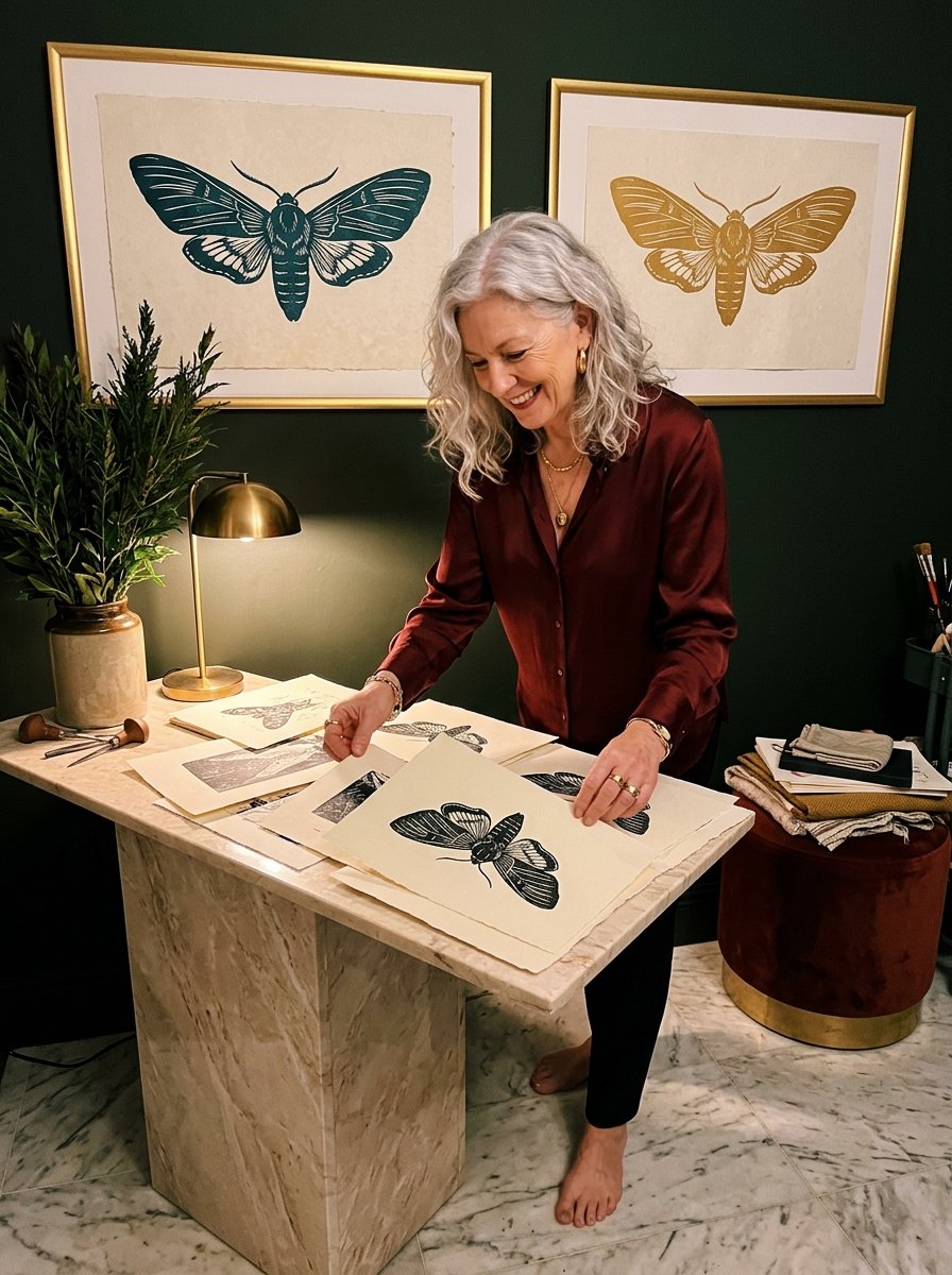
The sky is the drawing. The tree is just the hole in it.
Step 8 — The 2 faults behind most failed lino print ideas for beginners
Fault 1 is a design with lines too close together. Fault 2 is too much ink. That is genuinely the whole list.
You will see fault 1 as a solid blob where your detail was. You will see fault 2 as furry edges.
If it looks wrong in a way neither of those explains, print it again first. I have re-cut a perfectly good block over one bad pull. Nobody else needs to do that.
A hare running. A fox curled. A hedgehog. A mouse with a seed. A horse’s head. A sheep. A cow, face on. A goose. A beetle. A dragonfly. A butterfly with plain wings. A ladybird.
A feather. A shell. A pebble with a band. A piece of driftwood. A pair of scissors. A spool of thread. A thimble. A pin cushion. An apple. A pumpkin. A bunch of carrots. A head of garlic. A crab. A starfish. A seahorse. An anchor.
Those 28 all pass the blob test. It is the only test that matters. Can you still tell what it is from across the room?
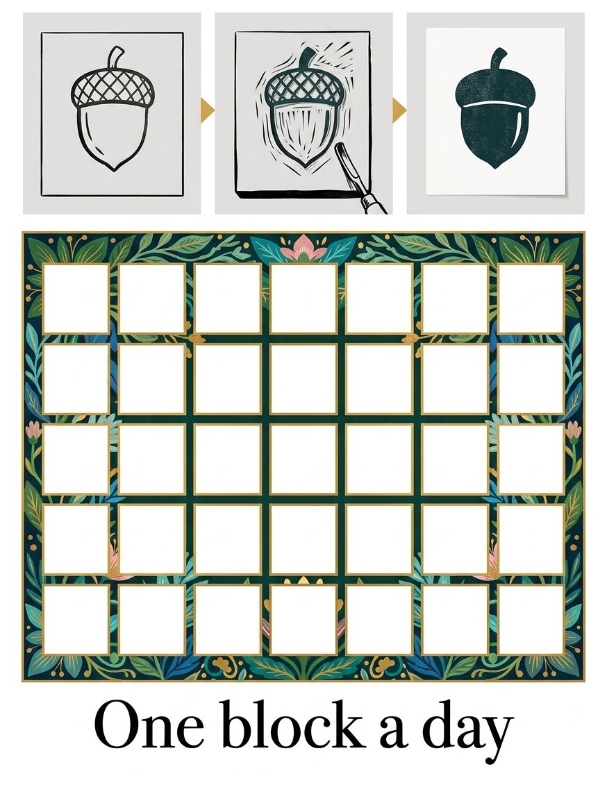
Free Starter Pack
10 pattern templates for the flat shapes a cleared background leaves behind.
Sent tonight. Small patterns to cut into a background that prints bare.
Unsubscribe in 1 click, no hard feelings
What is a reduction lino print, and should a beginner try one?
It is one block, printed several times, cut away more each time. Print the palest colour, cut away everything you want to stay that colour, print the next.
You will see the design get darker and smaller in stages. The catch is that the block is gone by the end, so the edition is all you will ever have.
Try it on your third or fourth block, not your first. (I tried it on my first. I still have the print. It is grey.)
Can I print these designs on fabric?
Yes, with fabric ink rather than paper ink, and a folded towel under the cloth instead of a hard table.
You will see fabric take less detail than paper, which suits every design on this page. Press harder and longer than feels necessary.
Wash-fastness comes from heat. Once it is dry, iron the back of the cloth for a couple of minutes. It will then survive a wash.
The gap, once you have cut 2 or 3 of your own, is never technique. It is having another good bold line ready on a Tuesday night.
32 folio sheets, 22 of them birds, every line already bold
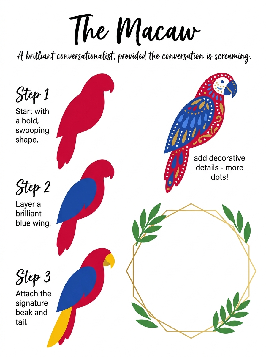
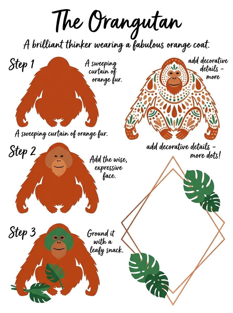
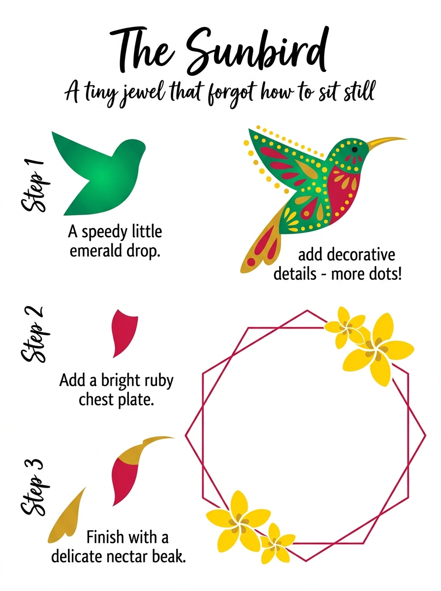
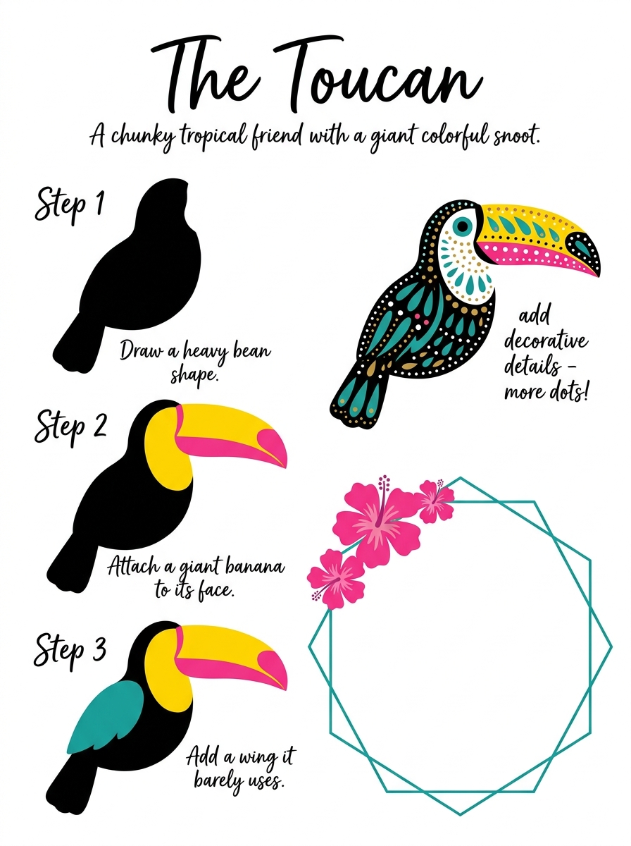
Start with the toucan and cut the beak last. Inside: 32 folio sheets drawn as the one closed outline a blade can actually follow.
Instant download · print as often as you like
Ink dries in about the time it takes to wash your hands. By then the line you cut at 9pm is somewhere on a sheet of paper. It is being permanent about it, and quietly pleased with itself.
Mirabelle wrote this. No training, strong opinions, many pens. Peer reviewed by a cat who sat on the drying proofs and signed them in paw.
—