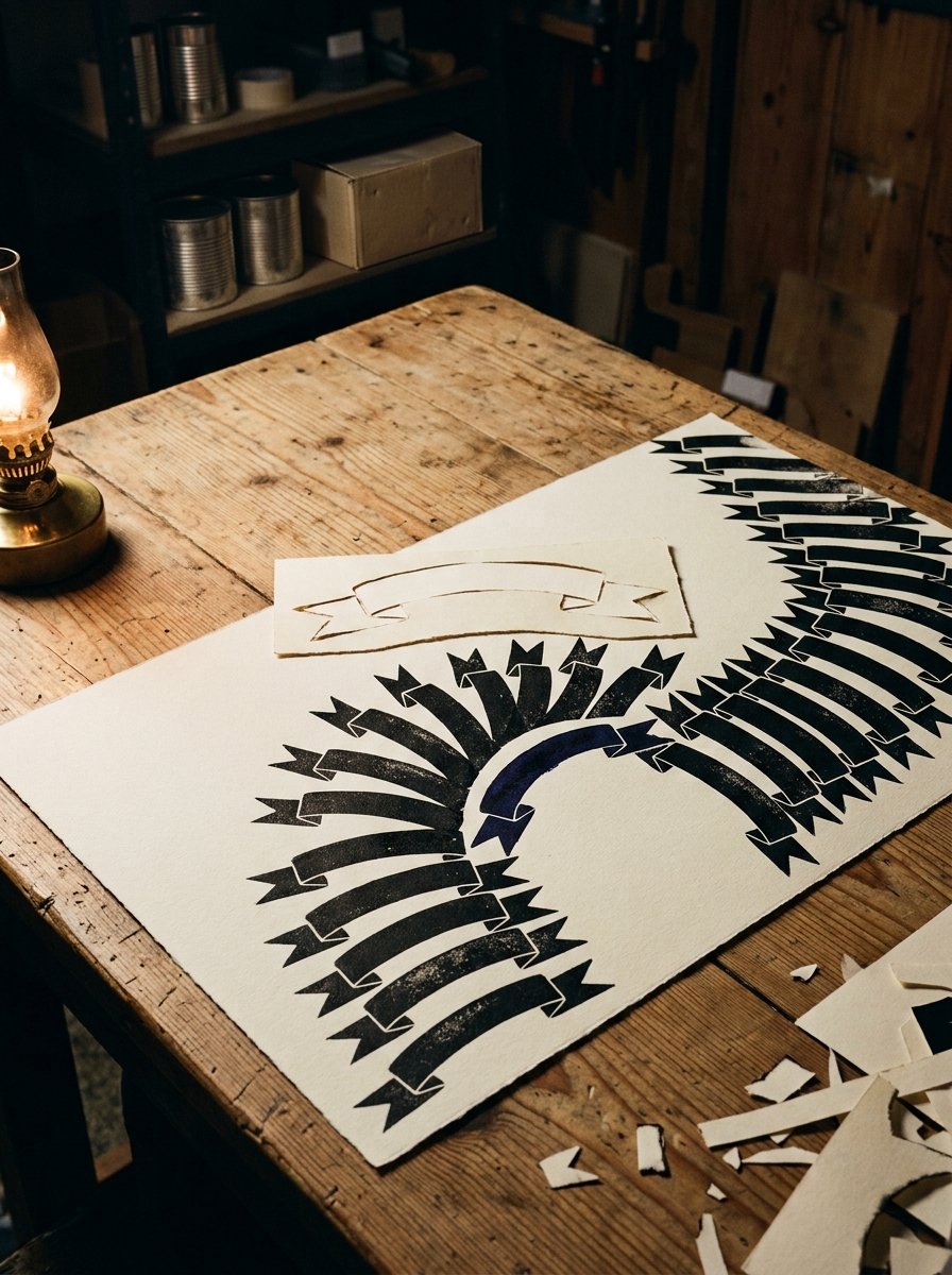
Every banner on every journal page is one shape underneath, a ribbon with a fold in it. Bullet journal headers have no correct width, and that is the whole trick.
Every header you have copied is one shape. A long band, with a fold at each end.
Stretch the band and it fits a word. Stretch it further and it fits a month. The fold never changes.
So there is no header for January and a different one for June. There is one shape and a decision about how wide.
(I drew a new one every month for a year. Separate arguments with a pen, one a month. The shape was identical and I could not see it.)
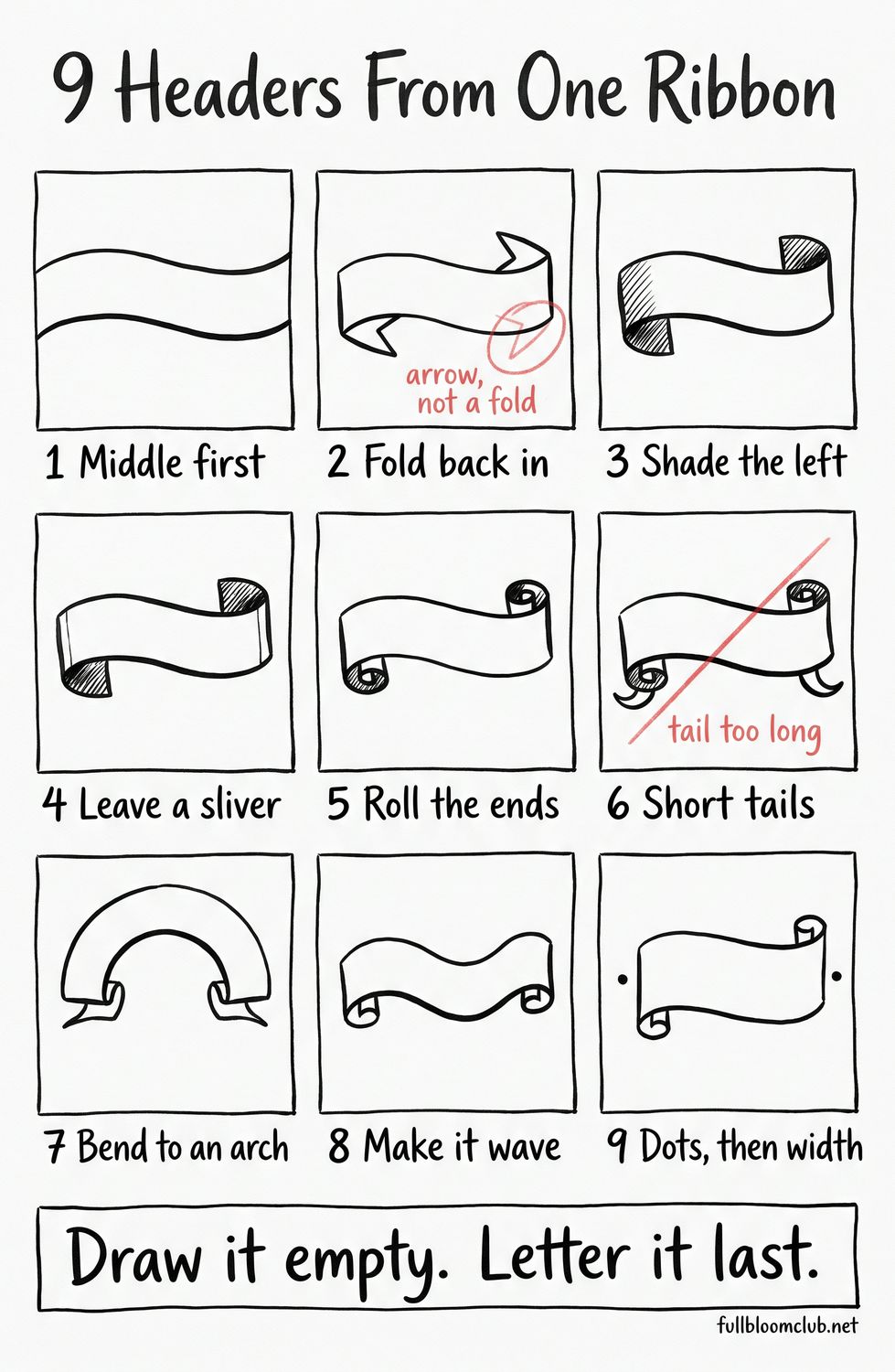
Below: the band, the fold, the tails, and the same ribbon bent into an arch. The free grid is 9 squares, one scroll ribbon and one new move in each, so you can work through it tonight.
Download the free 9 ribbon headers grid → Save
Print it at actual size. (Most print dialogs offer to shrink it to fit. Decline the offer.)
Square 1 is the bare band, middle first. Square 2 folds the ends back in. Square 3 shades the left side, which is the only thing that makes it read as a ribbon rather than a strip.
Then the sliver, rolled ends, short tails, an arch, a wave, and a long one between two dots. Two squares carry my old mistakes in red pencil. Please do not copy those two.
Fill all 9 squares once and the shape stops being a decision. It becomes a width, which is a much smaller thing to think about at 9pm.
Nothing on that sheet is difficult. It only asks you to draw the same shape more than once in one evening. That is the part everybody skips.
The band is deliberately empty, which leaves the obvious question of what goes inside it. That is the one part this page hands straight over.

The Collection
26 letters, A to Z, and each one is built in three passes, not drawn in one.
THE AVANT-BLOOM ALPHABET. Initials, anemones, and one letter an evening. For the night the ribbon is drawn and the middle is still empty. (A letter dressed in flowers is a letter with somewhere to hide.) Inside: 26 letters, A to Z, each built in three passes. What you get: the thing that goes inside tonight’s ribbon, and an initial you can put on anything.
The ribbon first, then. The letters can wait, and on most evenings they should.
The shape under all bullet journal headers
Two long lines, roughly parallel, closed at both ends. That is the header.
Draw the top line first. All the way across, in one go. Then draw the bottom line under it.
Keep the gap even. The gap is the height of your writing plus a little air.
Get that gap wrong and nothing else can save it. Too tall and the word floats in a tunnel.
Too shallow and the letters touch the edges, which reads as a mistake rather than a style.
The quick way to set it is to write the word first on a scrap. Then match the band to it.
Most people draw the ends first. Then the band has to arrive at an exact spot.
A hand that is aiming wobbles. A hand that is travelling does not.
(I drew the ends first for months. The band always landed just off. I blamed the pen. The pen was fine.)
So draw the middle. Let the ends turn up wherever the middle finishes.
That order is the difference between bullet journal headers that look drawn and ones that look aimed. Test it once on the back of an envelope.

The fold, and the wedge that makes it
At each end the band turns back on itself. The turned part is a wedge.
It points back towards the middle. Short edge at the top, long edge sloping down and in.
Point it outwards instead and the shape stops being a fold. It becomes an arrow, and it looks like one.
That wedge has a name, and it is older than any journal. A sign-painting course printed in Scranton in 1902 calls it the return.
The course is firm about what happens next. The return “must be shown by color or shading.”
That is the whole difference between a flat strip and a ribbon. One is paper. The other has a back.
The same lesson names every part, so you can ask for one by name. The bow, the broken band, the regular band, the returning band, the streamer, the roll.
It also says to shade everything in one design on the same side. Pick the left. Never change your mind halfway down a page.
And it explains why a shaded fold looks real. The darkest part sits slightly in from the edge, never on it.
The shadow cast underneath is the opposite. That one is strongest hard against the edge.
So fill the return with quick diagonal lines. Then leave a thin bare sliver along its outer edge.
(That sliver is called reflected light. It takes a second. It is the cheapest trick in this article.)
Shading is the only thing that tells the eye there is a back.
Run the shading on a scrap before you commit. Three or four strokes is usually enough weight. More than that and the fold goes solid black, which loses the sliver with it.

Bullet journal headers at the width of one word
Narrow. Notes. Tuesday. Books.
At this width the fold eats the band. One rule fixes it.
The return is never wider than the word. If it is, shorten the wedge until the word has room.
The ribbon is the container. It is not the event.
There is a very small engraving in New York that settles this. Sebald Beham cut it in 1542.
The whole sheet is about 4cm by 8cm. A winged figure holds one band that loops through itself.
The alphabet is laid along that band, A to Z, in order. The letters follow the turn.
Where the band rolls away from you, the letters stop. The shaded underside takes over.
Which tells you the order of work. The band is drawn first and empty. The letters arrive afterwards and bend with it.
The letters are a separate skill and a separate evening. There is already a guide on this site that does nothing else. This page is only about the shape they sit in.
(I have watched a perfectly good banner get abandoned over a wobbly R. The R is not the banner’s fault.)

The width of a date, and the two ends that have to match
Medium. Wide enough for 14 September. Narrow enough that both ends are in view at once.
This is where a mismatch shows. Side by side, the eye is very good at catching one wedge steeper than the other.
The 1902 course covers this too. Built on the symmetrical double curve, it says, a ribbon “must be made symmetrical on both ends.”
The fold can sit in the middle of that curve without spoiling it.
Here is how to actually get it. Draw one end. Turn the paper upside down. Draw the other.
Your hand then makes the same movement twice. It is not trying to make a mirror image, which it cannot do.
(Turning the paper is cheating. I have never met anybody who can match two ends the right way up, myself loudly included.)
Check it by half-closing your eyes. The two wedges should read as one weight.
If one looks heavier, it is usually longer rather than darker. Shorten it before you reach for more ink.

Bullet journal headers at the width of the whole page
Full width. Margin to margin. This is the one that goes wrong.
Mark both margins before the pen touches the paper. Two dots, one each side.
Then draw between them. The dots do the deciding so your hand can just travel.
Without them you are estimating about 15cm while also drawing. The estimate always loses.
Leave a clear gap above it as well. A full-width band pushed against the top edge reads as cramped.
Two finger widths down is plenty, and it makes the page look composed rather than filled.
Now the useful part, from a print in the Met. Cherubino Alberti made an engraving in 1628.
Its catalogue entry reads, in the calm way catalogue entries do: “proof before lettering on the banderoles.”
Two ribbons, printed completely empty. They were waiting for words nobody had settled on yet.
The engraver cut the ribbon first and let the text catch up. Do exactly that. Draw the ribbon empty, even when you are certain of the word.
(The month I lettered first, the banner finished 4cm short of the page edge. It floated in the corner like a draught had moved it. Otherwise a good month.)
A ribbon drawn around words you already chose can only ever be the wrong size.
An empty ribbon can be lettered tonight, tomorrow, or never.

That is the whole page-width problem solved with two dots and a decision to wait.
Free Starter Pack
Get 10 free pattern templates for the page around the header.
Sent tonight. Small fills for the space beside a banner, once the ribbon is drawn.
Unsubscribe in 1 click, no hard feelings
The tails, shortest and last
Under each return, a small flick of ribbon hangs down. That is the tail.
The 1902 list has names for these as well. The streamer and the roll.
Which means sign painters were arguing about tails long before anybody ruled a page.
Two rules, both about restraint. Tails go on last, after everything else is inked.
And they are shorter than you want them to be. Much shorter.
A tail that reaches the first line of writing stops being an ornament. It becomes an obstacle.
Curve them away from the centre, never towards it. A tail curling inwards makes the header look like it is closing.
One tail each side is the whole ration. Two on one side and the header starts to look like weather.
(Mine used to trail halfway down the page. Less like a banner, more like something the page was leaking.)
This is the moment the whole thing suddenly looks finished. It takes about four seconds. I have never once got bored of that bit.

The same ribbon, turned into an arch
Take the two long lines and bend them. Same gap, same folds, same tails.
Only the path has changed. Nothing about the shape has.
Draw the top arc first, lightly, as one confident sweep. Then the second arc underneath it.
Do not measure the second arc. Watch the first one and keep the gap steady by eye.
Measuring produces a gap that is correct and a curve that has gone stiff.
Turn the page sideways if the sweep fights you. An arc drawn across your body is easier than one drawn away from it.
The arch belongs over a month, at the top of a page. The straight band belongs beside a date. That is the only rule about which to use.
Ribbons as frames have a long history of being drawn this exact way. In Antwerp, around 1545, Cornelis Bos was engraving sheets of them.
They were published under a title that translates as “cartouches and other ornaments of various and capricious invention.”
Look at one closely and the construction gives itself away. It is a flat strap.
The ends have been slit, curled and rolled into little tubes. Every rolled end is shaded dark on its underside.
That shading is the only reason your eye knows which face is the front. Take it away and the strap goes flat.
Same instruction as the 1902 course, four centuries earlier, from somebody selling designs rather than teaching them.
(Capricious invention is my favourite description of a ribbon with a curl on it. I intend to use it about my own.)

The evening that makes bullet journal headers automatic
One page. The same shape, four times, at four widths.
Word width first. Then date width. Then full width. Then the arch.
Do not letter any of them. Draw the band, the return, the shading, the tails, and stop.
You will notice the third is better than the first. The fourth is better again.
That is the shape going into your hand, which is the only place it is any use.
(It takes about 20 minutes. I have done it on the back of an envelope waiting for a kettle, which is not the recommended paper.)
Do it once more the next night, and do it faster. Speed is what stops the line looking careful.
One shape, four widths, and by the fourth it has stopped being a decision.
After that, a header stops being a decision. It is a width, and you already know the shape.
What it still does not have is anything inside it, and a letter drawn in a hurry undoes a ribbon drawn carefully. That is the part worth borrowing.
The letters that go inside the ribbon, A to Z


Draw the ribbon first and leave it empty, the way the free grid sets it out. Then pick the initial that belongs in it. Skeleton, then foliage, then colour. By the weekend the shape and the letter both arrive without a discussion.
Open the Avant-Bloom Alphabet Collection →
Instant download · print as often as you like
The hand stops asking how wide and simply decides, somewhere around the fourth one. A month with a proper banner on it feels like a month somebody was expecting.
“The ribbon is used in many forms, and can be made to suit almost any style of inscription by folding or extending.”
A Textbook on Lettering and Sign Painting, Scranton, 1902
Mirabelle wrote this. No training, strong opinions, many pens. Peer reviewed by a cat who sat inside the empty banner and declined to move.