Paris, 1866. A man with exactly one etching needle worked out every texture he would ever need. Drawing textures has not needed a second tool since.
Not from the marks in the middle.
The eye reads a surface from its edge and from the gaps.
Fill the middle with careful scribble and the wall still reads as paper. Get the edge right and three marks will do.
A man in Paris wrote that down in 1866, while complaining about his tools.
Below are 47 textures in one black pen. With them, 8 secrets from people who only ever had a point. The chart is free and it comes first. (There is one empty box at the end of it. That box is the exercise.)
Download the free texture swatch chart →
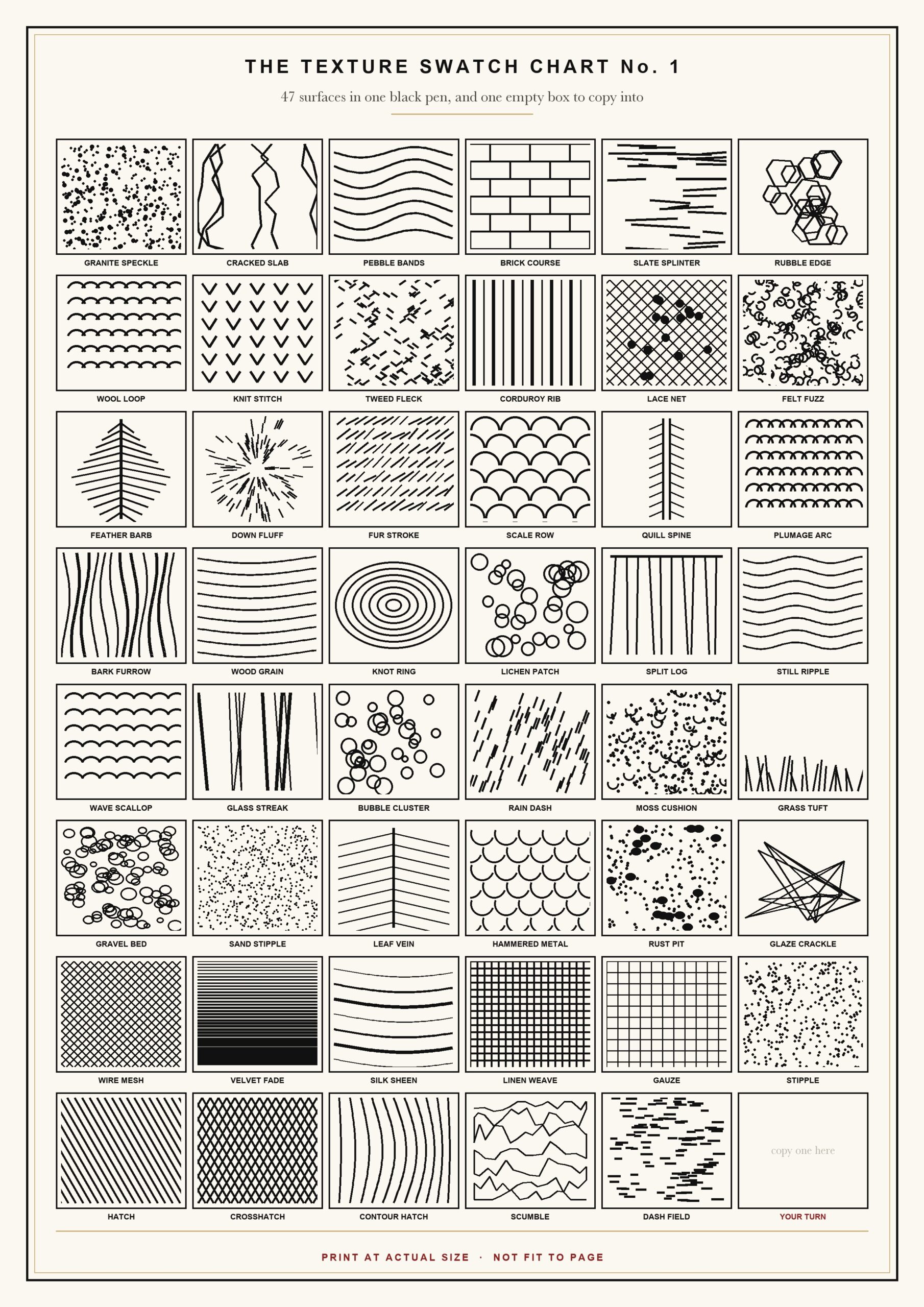
Print it at actual size, not fit to page. (Your printer will try to scale the page down. Say no.)
The chart holds 47 drawing textures in 9 families. Stone. Wool and cloth. Feather and fur. Bark and wood. Water and glass. Ground and plant. Metal and glaze. Soft cloth. Then the base marks the rest are built from.
Every swatch is one black pen. No grey, no smudging, no second tool.
Work across a row, not down a column. The rows are grouped by material. A row teaches you a family. A column teaches you nothing.
I ran the whole sheet twice before I understood the empty box. It is not decoration. Copy your worst swatch into it at twice the size. Big is easier. (Mine was Granite Speckle. It kept coming out as rain.)
One pen is not a limitation here. It is the condition every person below worked under. That is why their advice still fits your hand.
Which leaves one honest gap. A chart of marks is not a picture. It hands you surfaces and nothing to put them on.
The Collection
You have the drawing textures. Now what do you put them on?
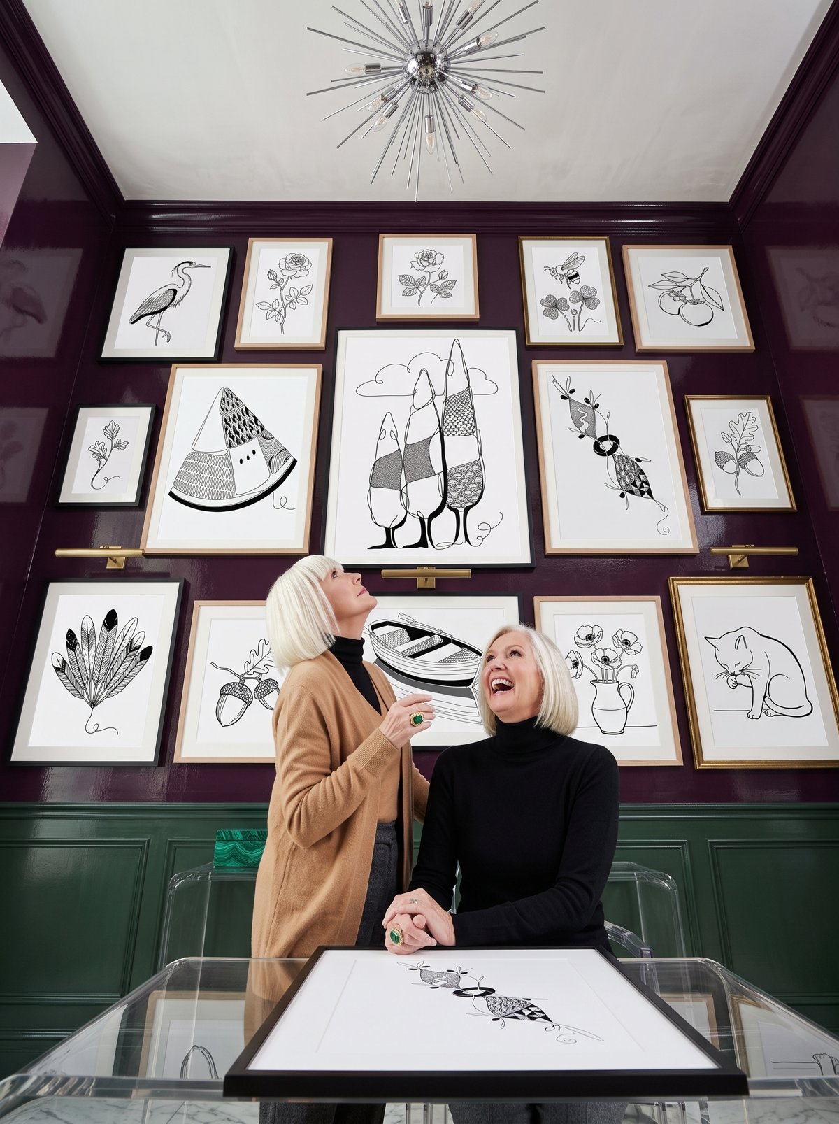
THE 100 COLLECTION. A heron, a ginkgo fan, a folding crane. For the evening the swatch boxes are full and the page is still empty. (A chart of marks is not a picture. I found that out slowly.) Inside: 100 finished ink pieces, each with a 5-step draw-along and a faint trace guide. What you get: a surface worth covering, and a wall of pieces that look bought.
So, the 8 secrets. Each belongs to somebody who had a point and no way to cheat.
Maxime Lalanne had one needle, so he built every one of his drawing textures out of the stroke
Paris, 1866. Lalanne writes a manual for etchers and opens with a complaint.
He has one point. It behaves the same way every time. Stone, water, cloth, sky: one tool for all of it.
His answer sits on page 5 of his own treatise. “We have at our disposition only a point, the play of which on the varnish is always the same. It follows that we must vary its strokes.”
Before drawing he scribbles a row of figure-8s in the plate margin. If the needle catches instead of glides, he regrinds it.
(I have adopted this. My first line of the evening is no longer a write-off.)
For your hand: the mark never changes, so change what you do with it. Spacing, direction, length, pressure. That is the whole instrument.
Tonight, three ways in. Run Stipple and Hatch side by side, with the pen held identically. Or draw Crosshatch, then Contour Hatch, and watch the second one bend round a form. Or fill one box with Scumble and one with Dash Field. They are the same energy at two speeds, and only one holds the paper open.
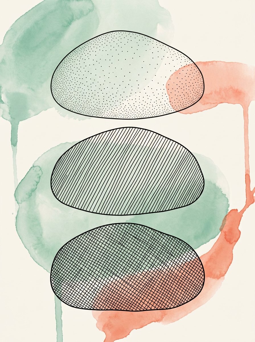
Joseph Pennell proved that a texture is lost from the white side first
London, 1889. Pennell writes the standard book on pen drawing.
He keeps returning to one failure. Artists draw well. The drawing is then reduced for printing, and the whites close up.
His book puts it plainly. The spaces shrink until you get “a dirty black mass, owing to the ink filling up the spaces between the lines.”
He notices something useful about single lines too. Grey lines stand up in groups of 4 or 5. One will not, and has to be thickened.
For your hand: watch the gaps, not the marks. When a texture goes muddy, you added lines. (I have never once fixed a muddy patch by adding more. I have tried it perhaps 40 times.)
Tonight, three ways in. Draw Velvet Fade, which is only lines closing up, and stop one row before solid. Or run Silk Sheen and let thickness carry the shine while spacing stays even. Or put Linen Weave beside Gauze. Same grid, wider spacing, and the second is lighter with no softer mark anywhere.
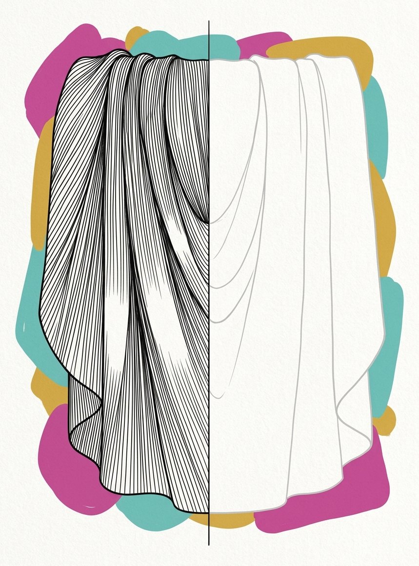
Arthur Guptill left the stone face blank and drew only the joints
Guptill’s pen-and-ink manual, published in 1976, does the arithmetic nobody bothers with.
A brick is about 2 inches by 8. He works out what that means across a large wall. His conclusion: drawing all the bricks is impractical.
So he does not. He draws the shadow in the joint. The brick face stays paper. “Sometimes the shadows themselves are all that is needed,” he writes.
His warning is the one I break most. Lines too close together are worse than lines too far apart.
For your hand: white paper is not the background.
It is the lightest thing you own, and it is already on the page.
Tonight, three ways in. Draw Brick Course and ink only the horizontals. Every brick face stays empty. Or try Granite Speckle and Slate Splinter on one rectangle, as dots and as flicks, and see which reads harder. Or draw Cracked Slab, Pebble Bands and Rubble Edge. Let the outer edge describe them while the middle stays nearly bare.
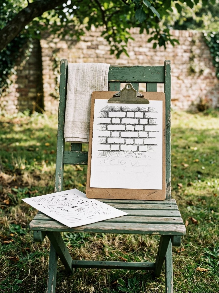
Charles Meryon drew his buildings upward, the way the masons put them up
Paris, 1854. Meryon etches the apse of Notre-Dame on a plate about 17cm by 30.
He builds it from small studies made on scraps of paper. Each one is drawn at the same hour of day. Then he glues them together into the full subject.
And he draws every building from the bottom up. Dodgson recorded the reason in the 1921 catalogue. Buildings are begun from the foundation, so the artist should follow the builder.
It sounds like a superstition. (I assumed it was one, and drew a wall downward to prove it. The wall hung there like wet washing.)
Marks stacked upward sit on each other. The gaps between them start reading as mortar.
For your hand: order is what makes a surface look heavy.
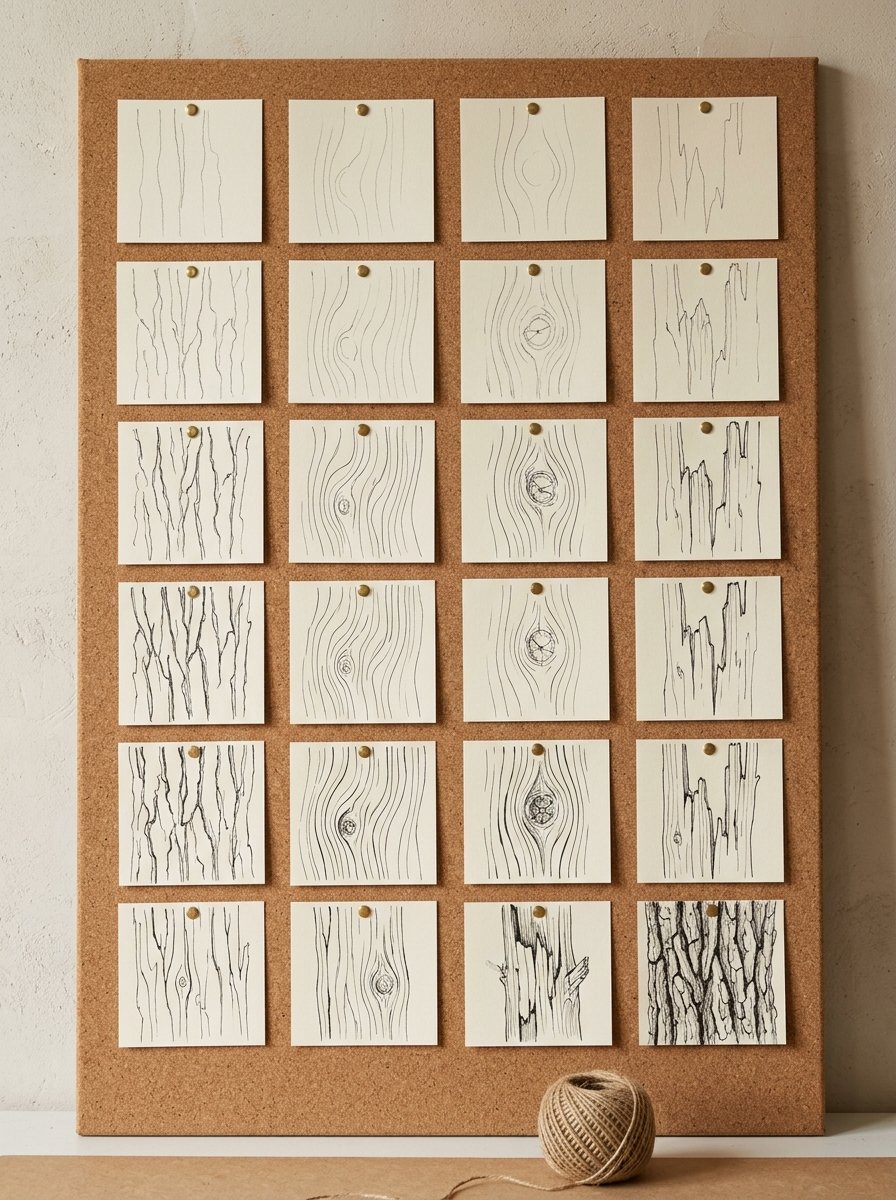
Tonight, three ways in. Draw Bark Furrow from the roots up, each mark landing on the one below. Or run Wood Grain and Split Log across one plank shape, flowing against splintered. Or put a Knot Ring in the middle of the grain. Bend every passing line around it, because the timber did that first.
Then add a Lichen Patch on top, as small open rings with bare paper left inside each one.
Charles Tunnicliffe made feather maps, and argued with himself about one edge
Anglesey. Tunnicliffe’s first measured drawing is a jackdaw, November 1935. Over 300 of them survive in the collection at Oriel Môn.
He called them feather maps. He drew single feathers separately, and wrote the bird’s measurements beside the study.
The best part is in Bird Portraiture, 1945, where he catches himself. On one bird the buff edges are “not so much edges as spots or notches.” On another, a year on, “they are really edges and not a fringe of spots.”
That is a draughtsman deciding, in writing, whether a boundary is a rim or a broken row. (I find this enormously comforting. A man with 300 feather maps still had to look twice.)
For your hand: before you draw any edge, ask whether it is a line or a row of dots. Almost every soft thing is the second one.
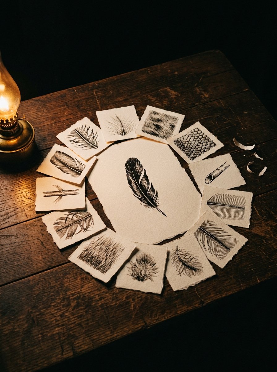
Tonight, three ways in. Draw Feather Barb as strokes off a spine. Then break the same edge into notches and compare. Or run Down Fluff against Fur Stroke, one radiating and one lying flat. That is their only real difference. Or draw Scale Row, Quill Spine and Plumage Arc, keeping every curve travelling the same way round.
Anders Zorn built his drawing textures from one direction of line and the gaps between
Zorn shows 100 etchings at Durand-Ruel in 1906. The catalogue preface names his method outright: hachures parallèles. Parallel hatching.
He shades with one direction of stroke. Spacing and weight change. The angle does not.
A critic in Century Magazine, August 1893, described standing too close to one. The strokes “hardly seem to have definite meaning.” Step back, and each is “full of most accurate purpose.”
That gap between close-up and across-the-room is the entire mechanism. (I checked this on my own kitchen doorway, at some distance, feeling ridiculous. It works.)
For your hand: pick one angle for a whole surface and hold it. Tone comes from how much paper you leave between strokes.
Tonight, three ways in. Draw Still Ripple in one direction only, opening the spacing toward the light. Or run Wave Scallop and Rain Dash together, both leaning the same way, so the weather looks like one weather. Or draw Glass Streak and Bubble Cluster on a jar. Keep every streak vertical, and let the bubbles be the only round thing.

Käthe Kollwitz laid real cloth on the plate and let the weave draw itself
Berlin, 1904. For the print Junges Paar, Kollwitz does something I still find slightly outrageous.
She lays actual fabric onto a soft-ground plate. Then she runs the whole thing through the press. The cloth lifts the ground wherever its high points touch, and the weave prints itself.
German catalogues call it Vernis mou mit Stoffdurchdruck, soft-ground with fabric impression. She did it again in 1912 with handmade laid paper.
What arrives on the plate is not lines. It is thousands of tiny interruptions with clean gaps. The edge of the fabric becomes the edge of the patch.
Make marks that stop, and let the stops line up.
For your hand: cloth is not drawn, it is interrupted.
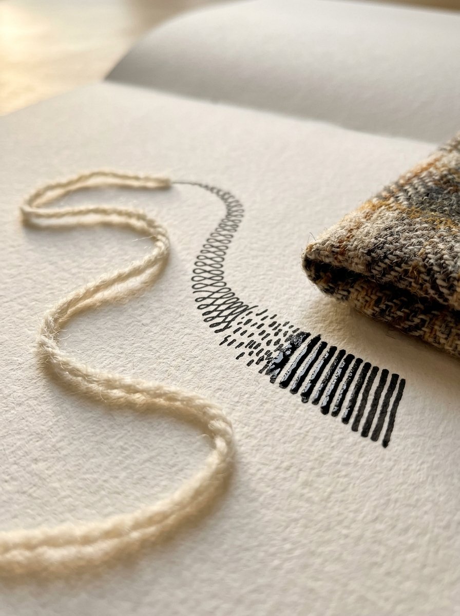
Tonight, three ways in. Draw Wool Loop and Knit Stitch as repeated units, and let them sit slightly wonky. Real knitting does. Or scatter Tweed Fleck and Felt Fuzz with no grid at all, keeping every mark short. Or draw Corduroy Rib and Lace Net, one strictly vertical and one strictly crossed. Stop each at a torn edge, never a ruled one.
Frank Short started with solid black and took the light back out again
Short is the mezzotint man. His 1888 manual explains the method in one clean paragraph.
The plate is roughened all over with a rocker until it would print solid black. The V&A holds one of his rockers: 50 teeth to the inch.
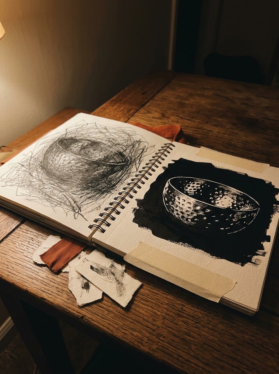
Then he removes. The engraver “cuts away the bur with a sharp scraper where it is to be lighter.” Where it must be quite white, “it is burnished smooth.”
He had a second trick for grain. Run sandpaper through the press against the plate, and “the sand pierces the ground in a multitude of places.” Silk works too.
For your hand: for a very dark surface, put the black down first and plan the lights. It is the opposite of how most of us work. (I resisted this for years on the grounds that it felt reckless. It is simply faster.)
Tonight, three ways in. Draw Hammered Metal and Rust Pit dark first, then leave bare spots as highlights. Or run Glaze Crackle and Wire Mesh, one random and one ruled, on one small square. Or fill a strip with Gravel Bed, Sand Stipple and Moss Cushion, keeping the pen bouncing rather than dragging.
That leaves two that are pure ground. Draw Grass Tuft from the base upward, the way Meryon would have, so each blade stands. Then Leaf Vein: one spine, everything else angling off it. It is a feather with the fluff removed.
The drawing textures chart, and how to use it tonight
The sheet is not a poster. It is a practice page with 47 boxes and one empty one.
Pick the family you actually need. Drawing a cottage means stone, bark and wood. Drawing a pet means fur and feather.
Do that row across. 6 swatches takes about 15 minutes. Then fill the empty box at twice the size, using your worst one.
Then put the chart beside a real object and copy the surface, not the outline. (A stone from the garden is the best first subject. Nobody can tell you it is wrong.)
Free Starter Pack
10 pattern templates, for the surfaces a swatch chart leaves blank.
Sent tonight. Small fills for stone, cloth and bark.
Unsubscribe in 1 click, no hard feelings
One evening of drawing textures will not make you fast. It will stop you filling the middle, which was flattening everything.
And when the marks start behaving, the problem changes shape. You have surfaces now, and nothing worth covering with them.
Every one of the 100 pieces arrives with a surface already worth filling
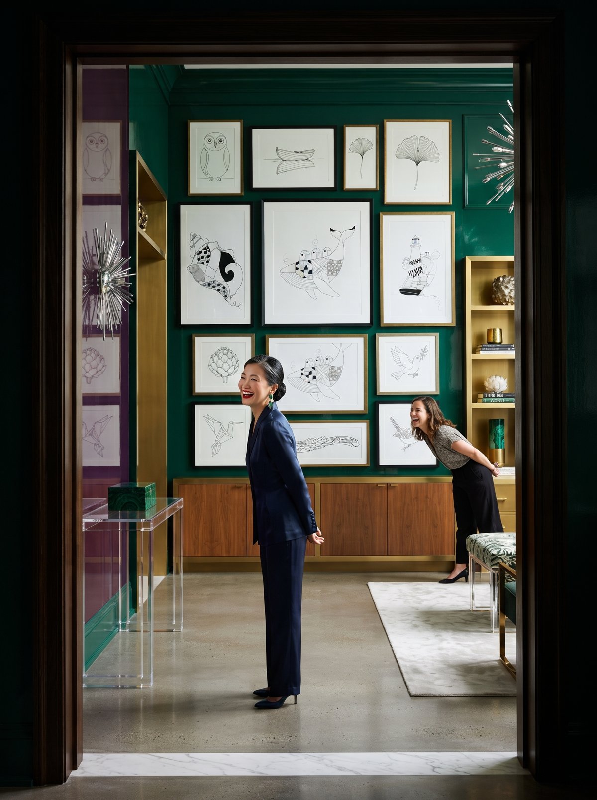
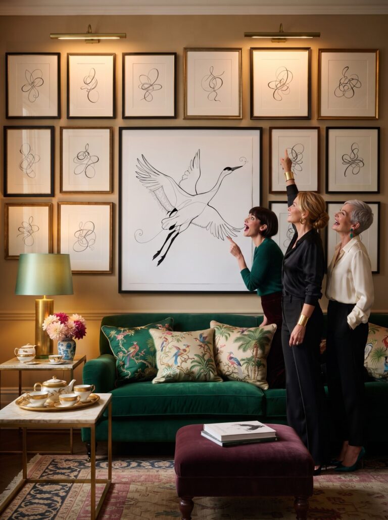
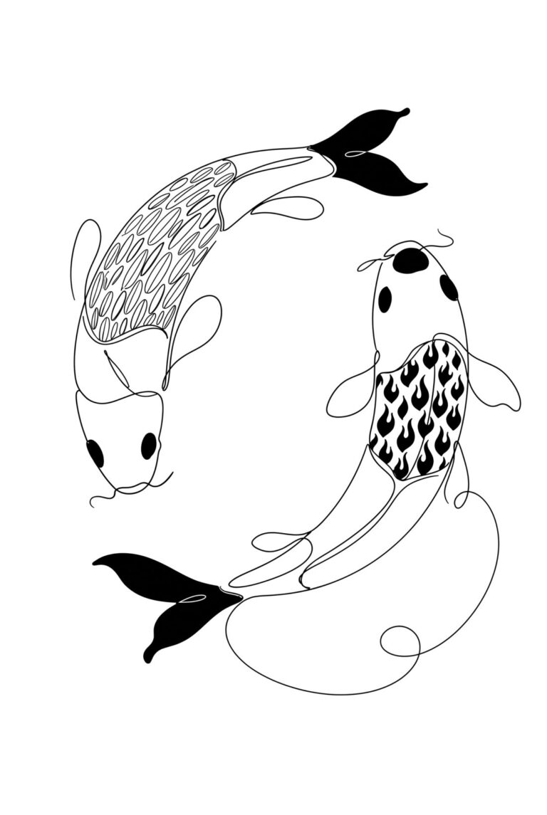
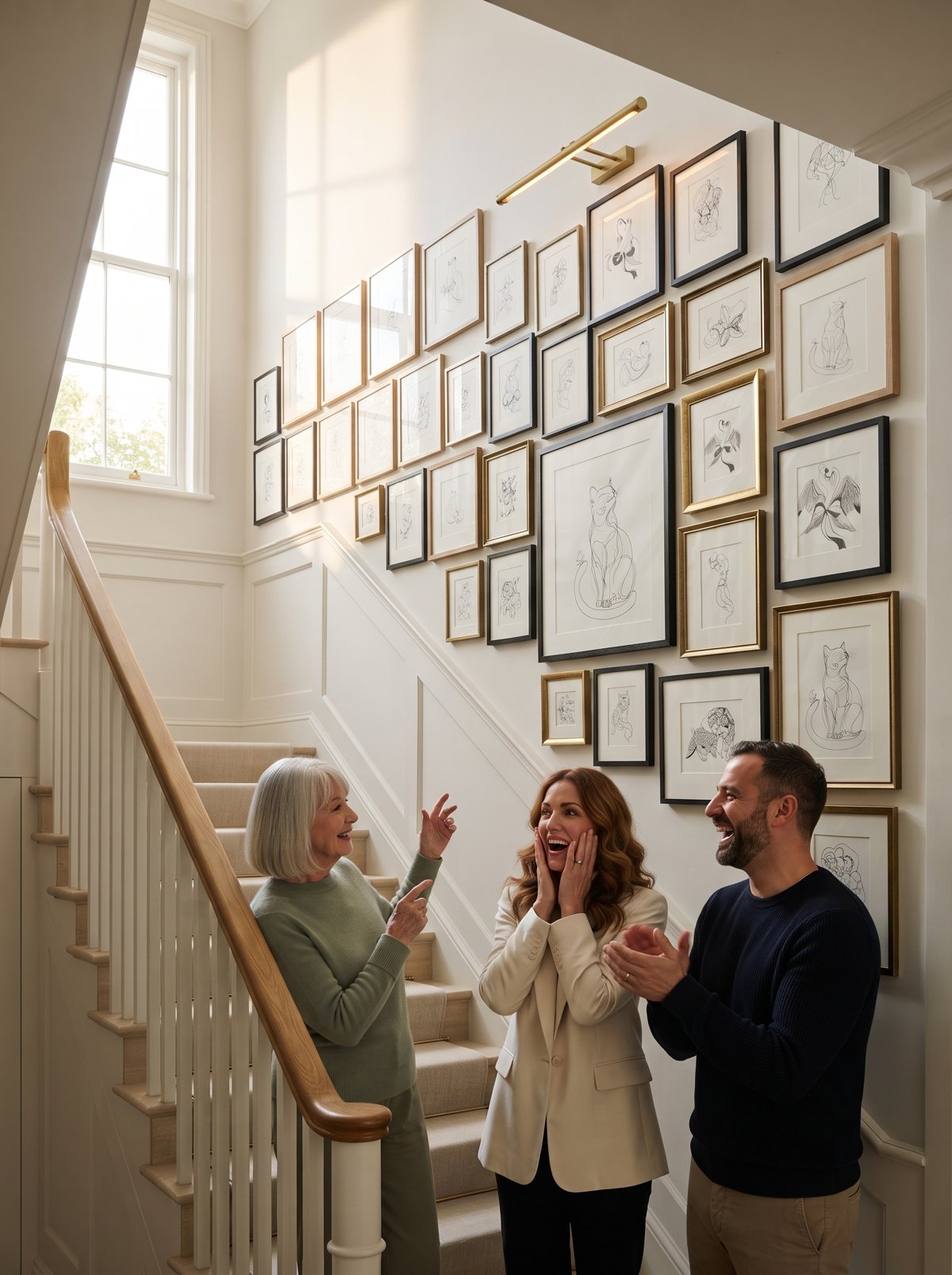
Begin with the heron, then the three stones. Inside: 100 pieces, 100 draw-alongs and 100 faint trace guides, for the evenings when the marks behave and the page is still bare.
Instant download · reprint it whenever you like
Every surface in the house is a row on that chart. The wall, the cat, the bread board, the jug you keep meaning to draw. None of them will hold still, and none of them has to.
“Every mark on a plate, however slight, yields a very exact likeness of itself in the impression.”
Frank Short, On the Making of Etchings, 1888
Mirabelle wrote this. No training, strong opinions, many pens. Peer reviewed by a cat who tested every surface in the house and approved the wool.