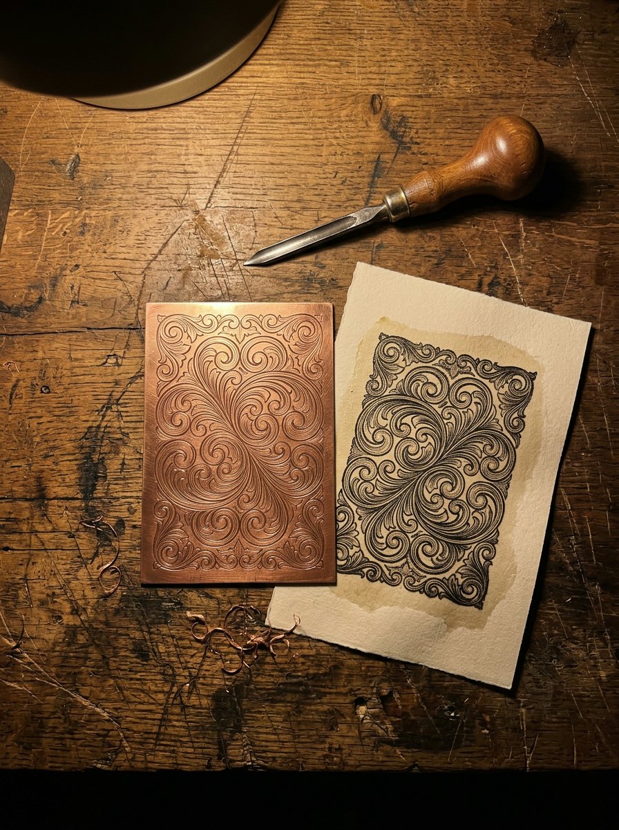
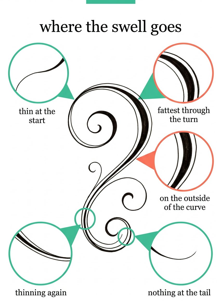
An engraved line is one line that got fatter in the middle and thinner at both ends. Filigree drawing is that, repeated, and it is not a steady-hand problem.
It arrives thin. It fattens through the turn. It thins again and ends at nothing.
That change of weight is the whole engraved look. Filigree drawing is weight, not steadiness.
A swell can be drawn slowly. It takes two strokes and a pencil you are allowed to erase.
Below: where the swell goes, why a tail must vanish, and how two scrolls build a corner.
Download the free scroll sheet →
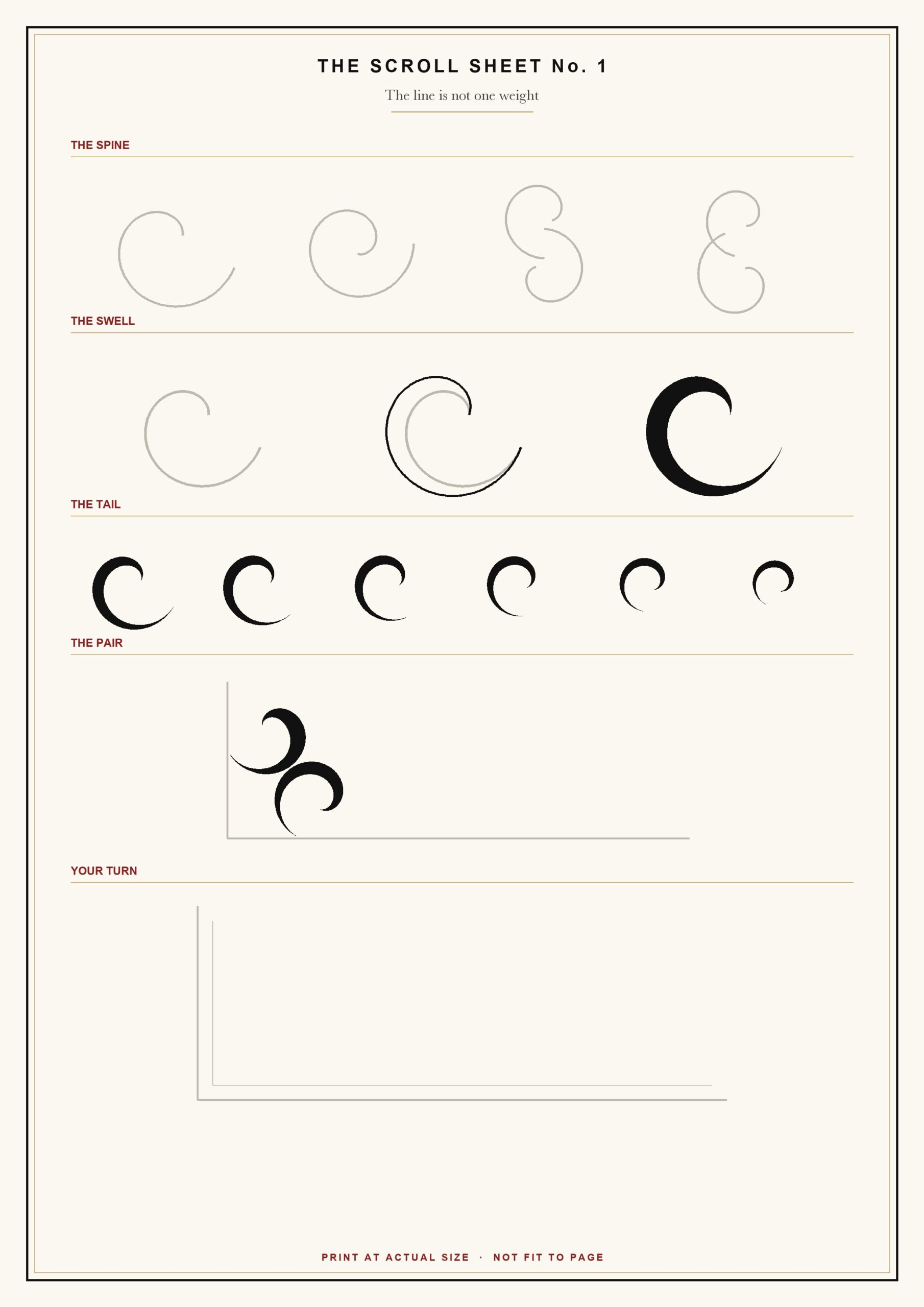
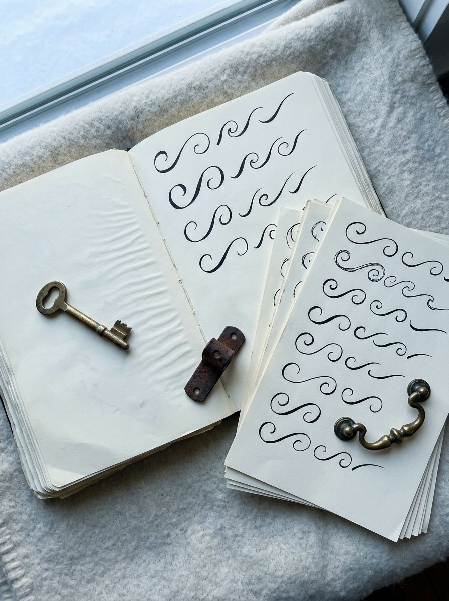
The sheet carries four printed spines, a row of bare tails and one empty corner. A spine is the curve before any weight goes on it. (Mine took 20 minutes. The corner took three goes.)
The bands run in the order the hand learns them. Spine, swell, tail, then the pair that makes a corner. I drew them in the wrong order for months. The corners came out nervous every time.
Work in pencil first and ink the swell afterwards. Nothing on the page has to be right first time.
Here is the claim this article takes apart. Engraved work needs a steady hand. It is repeated everywhere and it is wrong.
Most advice tells you to practise until your hand stops shaking. That is the wrong target. A shaking hand ruins a long thin line. It barely shows in a line that changes width.
A thin line records every hesitation you had. A swelling line hides it.
The thickness does the work your nerve was supposed to do.
If you would rather have the swell drawn for you, there is a set of letters built on this logic. Each one arrives as a bare skeleton, then dressed in foliage, then struck in colour.
The Collection
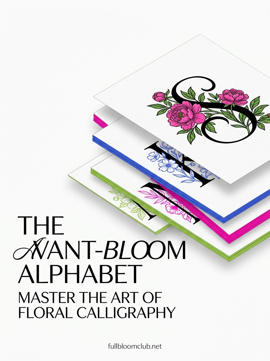
THE AVANT-BLOOM ALPHABET — letters, foliage, and one initial that looks cut rather than written.
By the time the second scroll lands, you will want something to wrap it around. For the evening a plain initial is not enough. (Mine went on a parcel. The parcel came second.) Inside: 26 letters, A to Z, each one a bare skeleton, then dressed, then struck in colour. What you get: an initial worth framing, and a corner with a reason to exist.
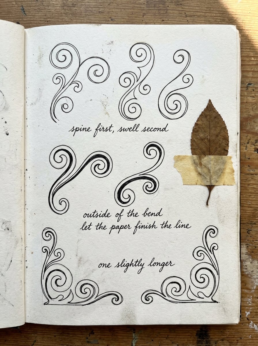
So: spine first, swell second. Start with the spine.
Filigree drawing is not one line weight, and that is the whole trick
Draw one C-curve with a fineliner, all the same width. Look at it. It reads as wire.
Now draw the same curve in pencil. Thicken the outside of the bend only. It lifts off the page.
The eye was never reading your steadiness. It was reading contrast.
(I spent a year buying finer and finer pens. The pen was never the problem.)
Try it on the back of an envelope before you believe me. One even curve, one swelled curve, side by side. The difference is not subtle and it takes 30 seconds.
Here is the first move, and it is small. Draw a C-curve. Thicken the outside of the bend. Stop there.
What you will see is a curve with a fat middle and two thin ends. What you should not see is an even ribbon.
If it came out even, you thickened both sides. Erase one side and keep the other.
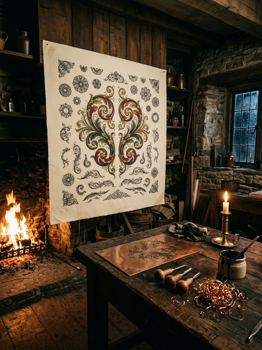
The engraved look was cut into metal, not written by hand
In 1605 Jan van de Velde published the Spieghel der Schrijfkonste. The title means Mirror of the Writing Arts.
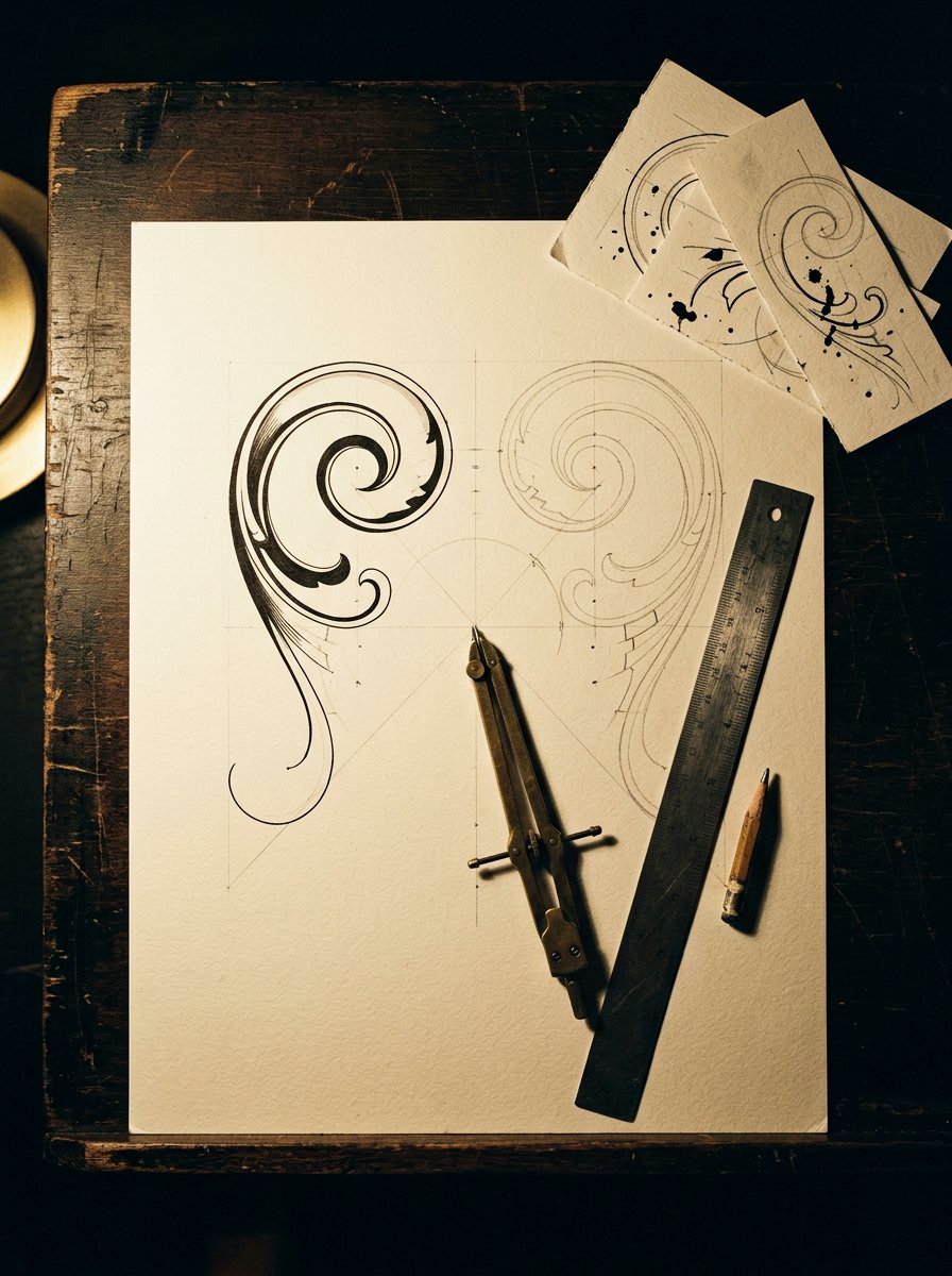
Its flourished pages are not handwriting. They are engraved plates, cut into copper and printed.
Those pages carry ribbons that cross and re-cross without a wobble. No pen holds a line that long. A graver can stop, breathe, and come back to the same furrow. A pen that stops leaves a blot.
A burin is pushed through metal, not dragged across paper.
The old description is still the best. A burin “acts exactly as a plough in the earth”. It makes a furrow and turns out a shaving of metal.
Push deeper and the furrow widens.
A wider furrow holds more ink, so the printed line is fatter.
Lift slightly and the furrow narrows to nothing. That is the taper. It is a change of depth, not a flick of the wrist.
One more thing engravers do, and it changes everything. They turn the plate, not the tool.
Do this tonight: turn the paper instead of your wrist. Every bend gets rotated to face you.
You will see your curves stop leaning the same way. (I turned the page for years without noticing I was doing it.)
What a whole century admired was metal, not penmanship
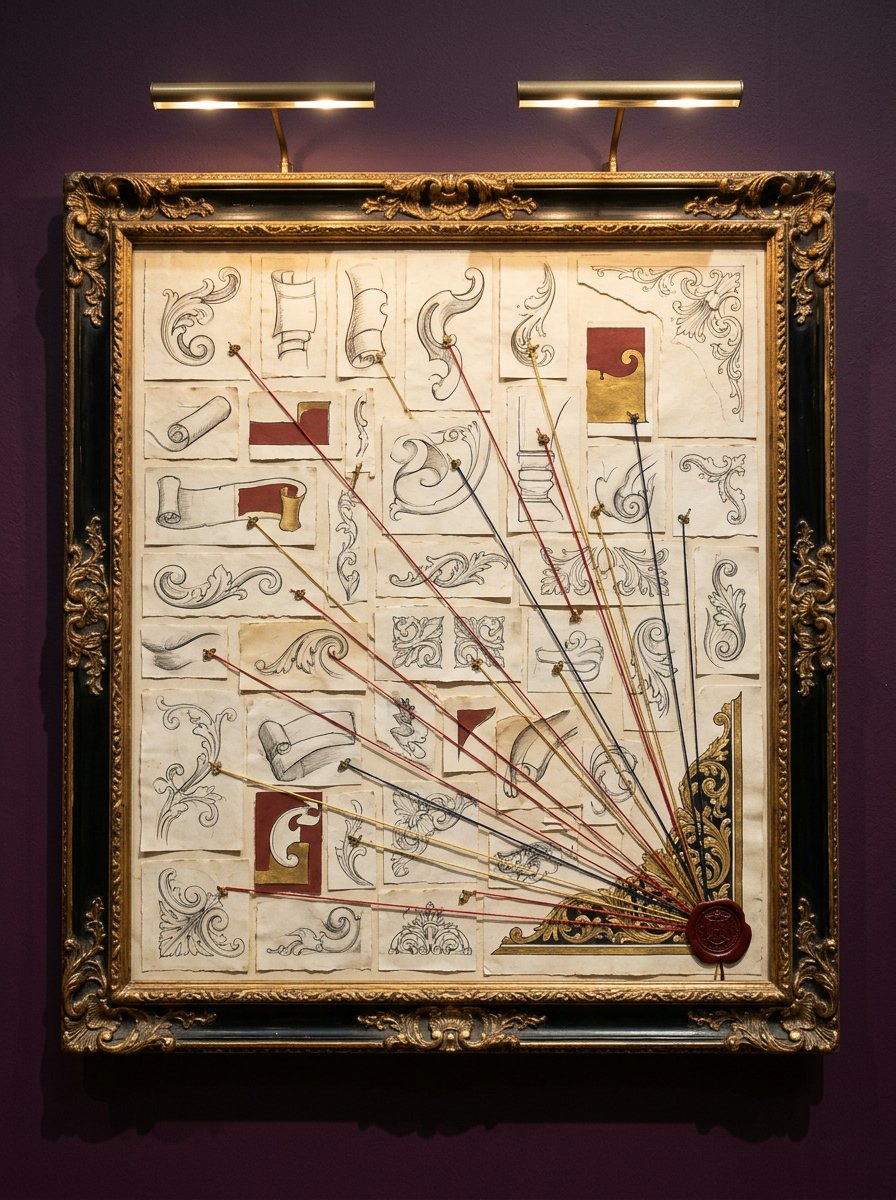
Between 1733 and 1741 George Bickham issued The Universal Penman in 52 parts.
He collected samples from 25 London writing masters and engraved every one. The parts carry his own line on them: “Engrav’d by George Bickham”.
So the most copied handwriting of the 18th century reaches us as cuts in copper.
A writing master sold copybooks, and a copybook had to be identical in every copy. Handwriting cannot do that. Engraving can.
So the ornament everybody copied was shaped by what a graver could hold. It was never shaped by what a hand could hold.
The model thousands practised toward was not one pass of a pen. It was metal, worked slowly.
I have thought about that more than is reasonable. Nobody was doing it in one go. Neither are you.
Filigree drawing puts the weight on the outside of the turn
The swell is not in the middle of the stroke. It sits on the outside of the curve, just past the fattest part of the bend.
The inside of the turn stays a hairline. Always.
Do this: draw the spine. Add a second line beside it, on the outside of the bend only. Close the two lines at both ends.
What you will see is a long sliver. It is thin at the start, fattest through the turn, thinning again to nothing at the tail.
If it reads as a tube, you drew the second line on both sides. Keep the outside one.
If it reads as a leaf, you closed it too early. (I close them too early about half the time.)
The hardest part of a scroll is the eye. The eye is the tight curl at the centre, and it is where most scrolls die.
Draw the eye last, not first. Draw it first and everything else has to arrive at it, and nothing ever quite does. (I drew eyes first for a year. Every scroll looked like it was reversing into a parking space.)
A tail that stops at full width ruins the scroll
The tail is the last part of a scroll and the part everyone rushes. It has one job: to disappear.
Lift the pen while it is still moving. Let the paper finish the line.
If you stop and then lift, the tail ends in a small blob. (Mine did, every time, for about a fortnight.)
A tail that stops at full width reads as something cut off. A tail that vanishes reads as engraved.
The tail also has a direction. It should leave on the same side the weight is on. A tail that crosses to the thin side looks broken, and you will not know why.
Run 20 tails down the edge of a scrap before you commit one. They settle around number 12.
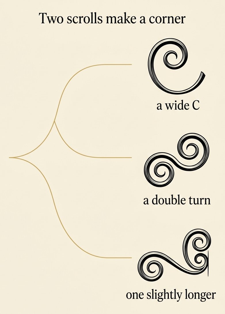
Two scrolls make a corner, and one of them has to be bigger
A corner is two scrolls turning away from each other. That pairing is what makes the eye call it engraved.
Mirror them and the corner reads as ornament.
Make them identical twins and it reads as clip art.
So make one a little longer. The difference should be small enough that nobody can name it. (I do it without thinking now, and I still get it wrong on tired evenings.)
The gap between the two matters more than either scroll. Too close and they read as one lump. Too far and the corner falls into two ornaments. About the width of the fattest part is right.
Charles Snell spent his career arguing for that kind of restraint. He pushed proportion over display, against the masters who flourished everything.
He and John Ayres were rivals. Their biographer records “many bickerings in the course of their joint career”.
The row was about how much ornament a page can carry. It is still the only question worth asking at a corner.
Filigree drawing goes wrong when every curve gets the same weight
The common ruin is enthusiasm. Every bend gets a swell, so the page turns into rope.
Pick one direction of travel. Swell only the bends that turn that way. Leave the others as hairlines.
What you will see is depth. The thin curves drop back and the fat ones come forward.
If the panel still reads flat, you have swelled too many. Erase half of them, starting at the edges.
There is a second ruin and it is quieter. Every scroll comes out the same size. A corner wants one large, one medium and one small, and the small one is what makes the others look deliberate.
(I lost a good page to this and only worked out why the following week.)
Free Starter Pack
Filigree drawing needs somewhere to put the pattern: get 10 free pattern templates, sent tonight.
Stripes, checks and dots. Drop one inside a scroll, a corner or an empty initial.
Unsubscribe in 1 click, no hard feelings
Print the scroll sheet and fill the first corner tonight
The four spines get harder down the page. The first is a wide C with room to be clumsy. The last is a double turn that changes direction halfway.
Ink the outside of each bend. Let every tail run off to nothing.
Then take the empty corner at the bottom. Put two scrolls in it, one slightly longer.
Stop while the corner still has paper showing. A corner with air in it reads as cut. A crowded one reads as a page somebody panicked at.
Print two copies. Use the first one badly on purpose. Keep the second for an evening when the hand is behaving.
A corner is one way in. A ring is another. The botanical monogram wreath is built from the same two strokes.
(I keep the sheet in a drawer and print it again rather than hunt for the file.)
Every corner you draw wants a letter in the middle of it
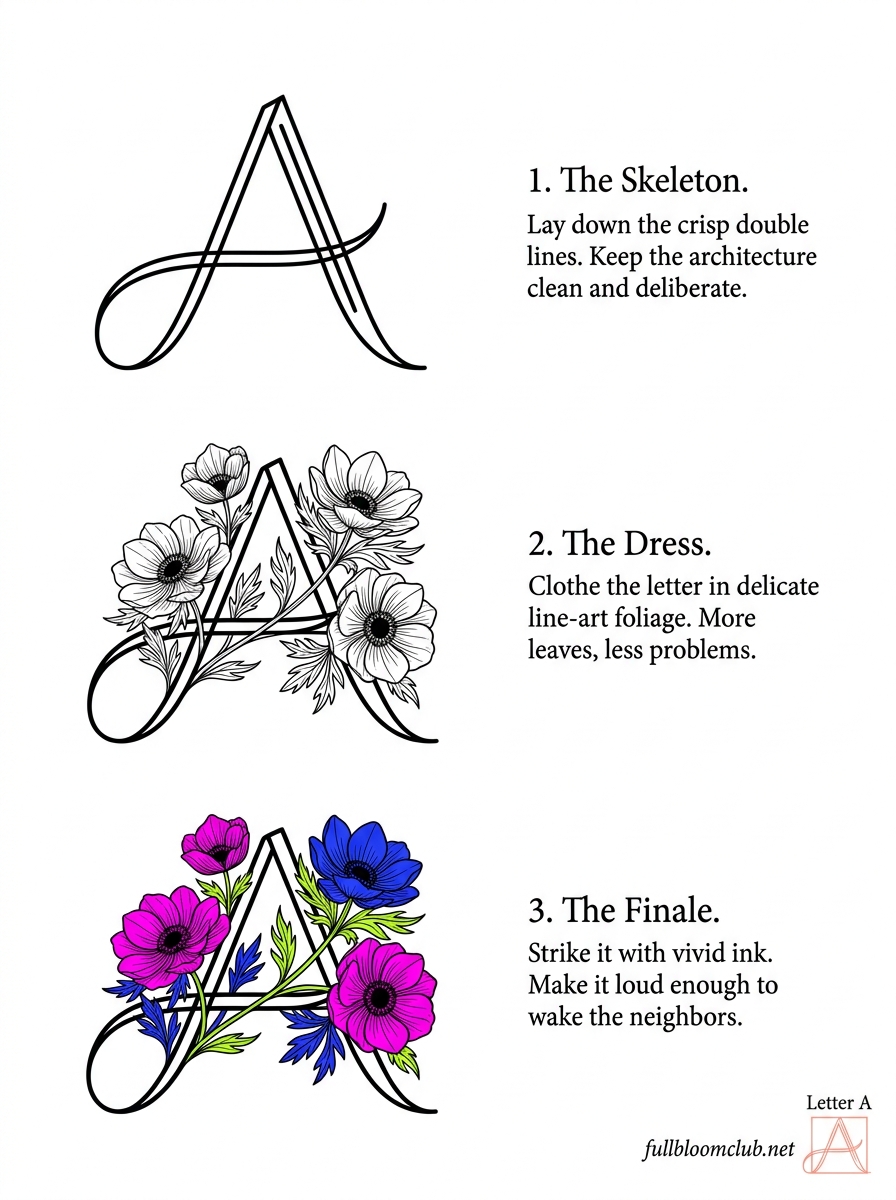
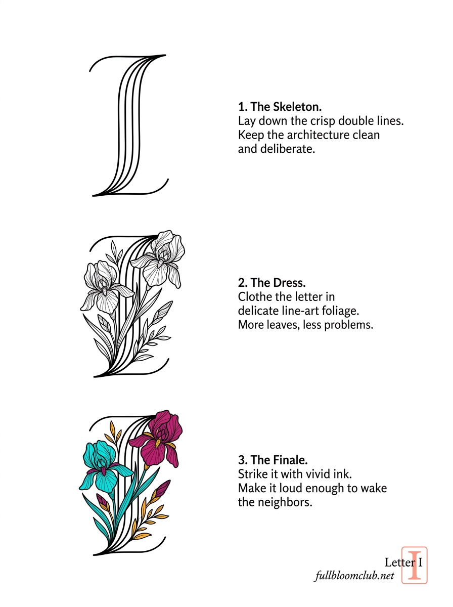
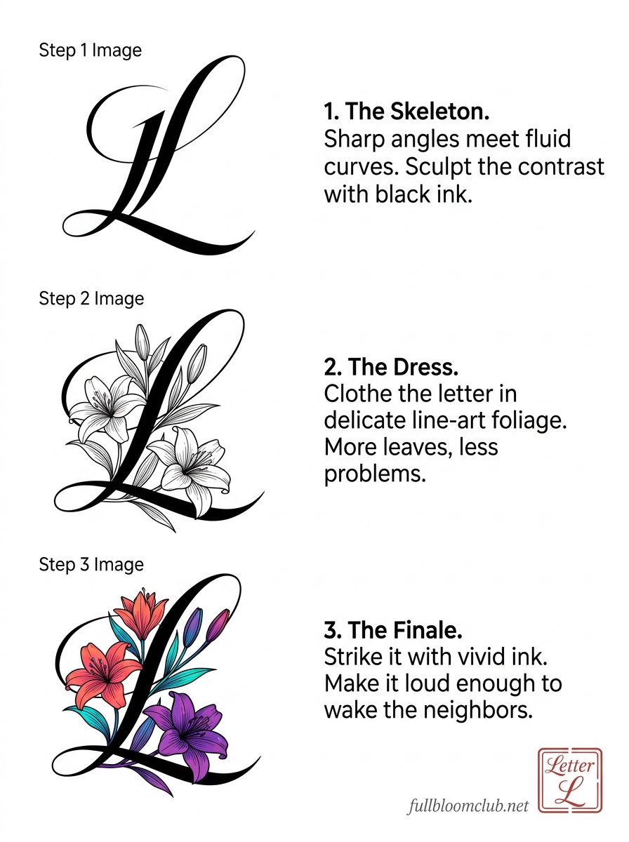
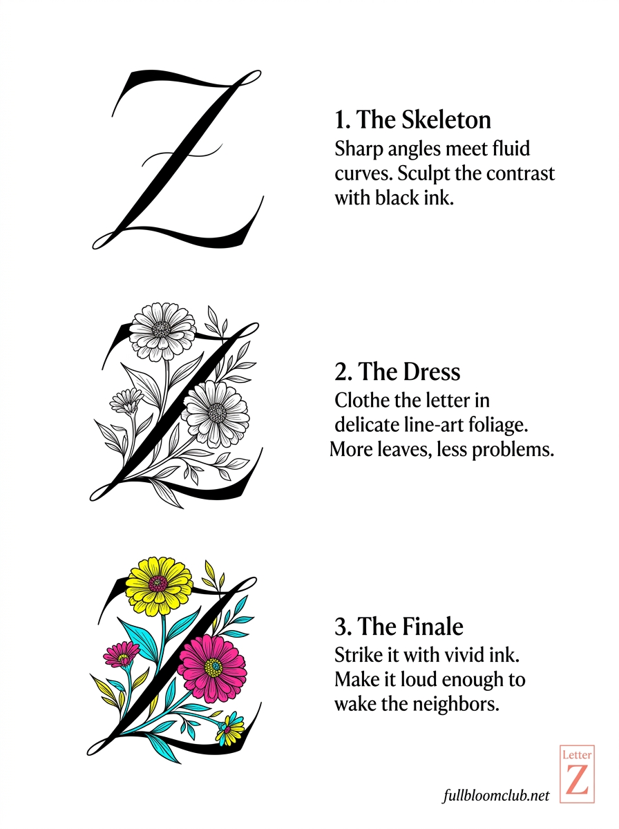
Draw the corner, then put an initial in the middle of it. Do one letter an evening. By the weekend you have a whole name. Inside: 26 letters, A to Z, each one shown as a skeleton, then dressed, then struck in colour.
Open the Avant-Bloom Alphabet →
Instant download · print as often as you like
The hand does not need to be still. It needs to know where the weight goes. After that it can shake as much as it likes on the way there.
“The art of writing made useful to the gentleman and scholar, as well as the man of business.”
George Bickham, The Universal Penman, London, 1741
Mirabelle wrote this. No training, strong opinions, many pens. Peer reviewed by a cat who uncurled one scroll with a paw and called it modern.