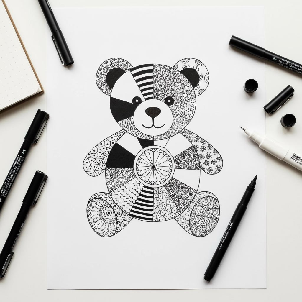
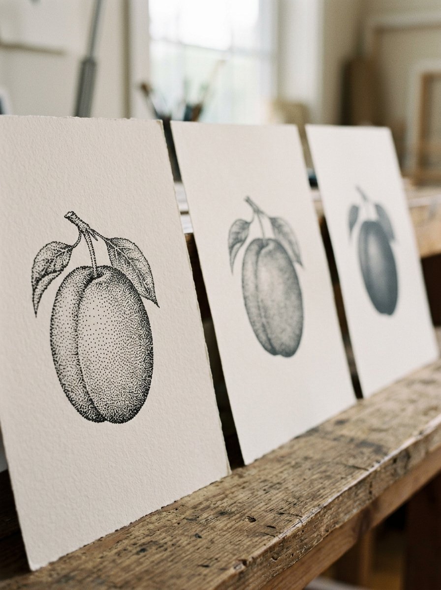
Stippling drawing has exactly one variable, and it is how close the dots sit. Everything else on the page follows from that.
Your eye stops counting almost at once and starts weighing instead. It reads the crowd, never the members. Nobody has ever counted the dots in a drawing.
So the dark is not made by pressing harder. It is made by putting more dots in the same space. (I believed shading was a talent for a long time. It turns out to be a headcount.)
Below are 71 ideas, sorted by the evening you have actually been handed. Not by subject, and not by difficulty.
Take the dot value chart first. It settles the only question that matters, which is how crowded is crowded enough.
Download the free dot value chart →
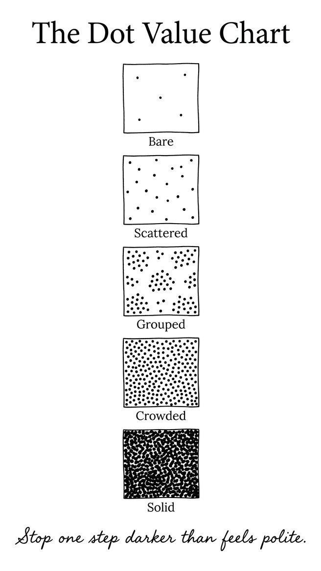
The chart runs 5 squares across one page. They are labelled Bare, Scattered, Grouped, Crowded and Solid. Each one is the same pen doing more of the same thing.
Set the print box to 100 per cent, not fit to page. (Shrink the chart and every square reads darker than it really is, which defeats the entire object.)
Then keep it beside the paper and match your square to a square on the chart. That is the whole use of it. Stop one step darker than feels polite.
Work small. A dotted area the size of a plum is 20 minutes. The same area the size of a hand is a week, and I have abandoned several.
That is the whole promise of stippling drawing. One variable, and a chart that tells you where you are on it.
Dots are a finishing move, so they need something finished to sit on. That is where The 100 Collection comes in. It is the collection this post came out of, and Japandi Ink is one of the 10 sets inside it.
The Collection
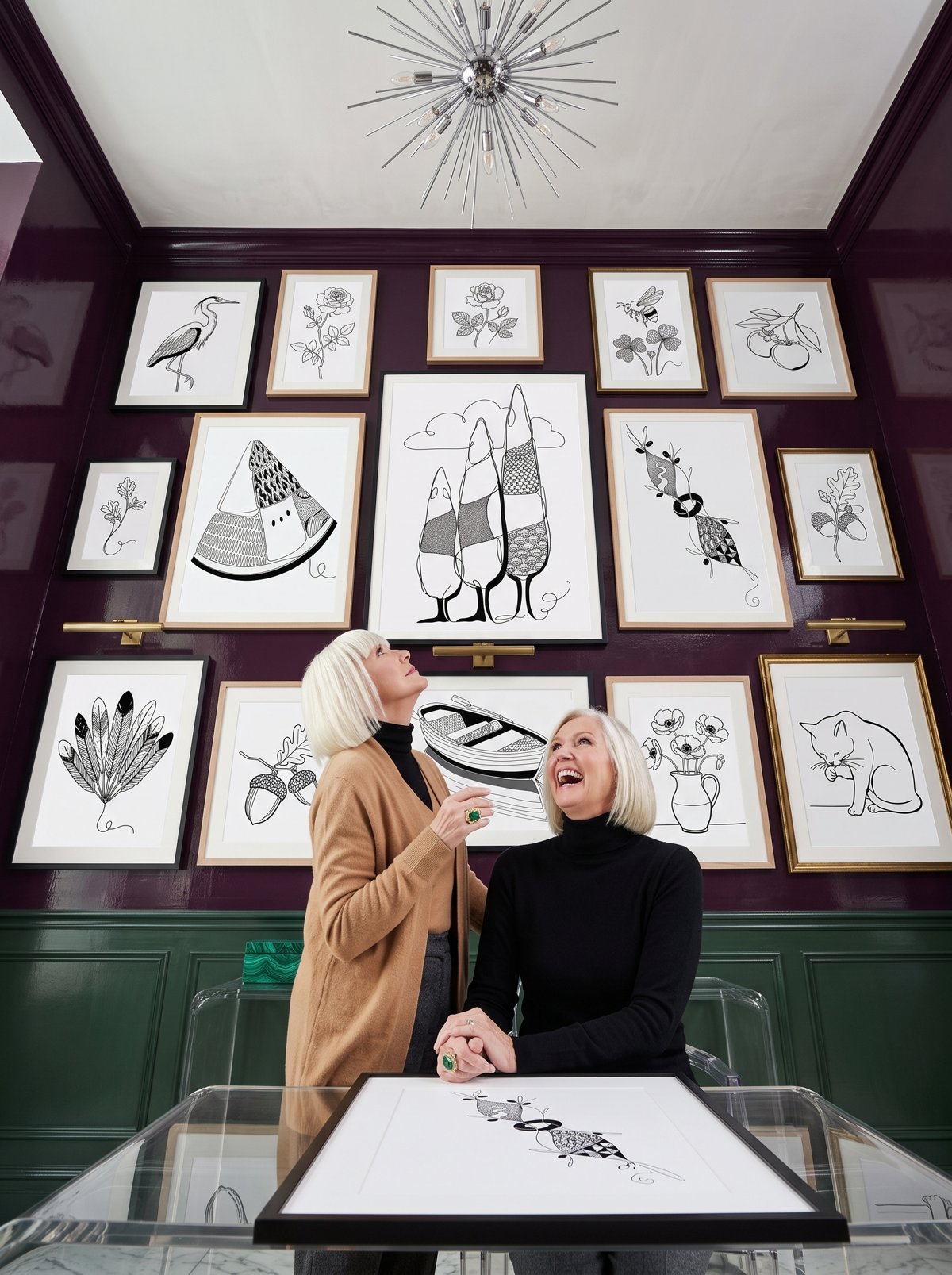
100 flowing-line pieces, and every one of them has a shadow side waiting.
This is the collection for the evening a drawing is finished except for its dark. Inside: 100 flowing-line art pieces in 10 themed sets. Each one has a 5-step draw-along and a faint trace guide. What you get: something to do at 9pm, and a wall of pieces that look like they cost money.
Back to the pen. Every group below names the state you are in, then the ideas that suit it, and what ruins each one.
Which stippling drawing ideas work on a bad day?
These 24 are small, round and forgiving. They ask for 20 minutes and no decisions.
Start with fruit. Fruit has one lit side, one dark one, and nothing else going on. A plum takes 3 passes on its shadow side and none on its lit side. A pear wants the dark gathered low, where it sits on the table. A fig is darkest in the dent at the top. A blueberry is almost solid, with one bare dot left alone.
Going round the whole edge evenly is what ruins all four. Dark belongs on one side.
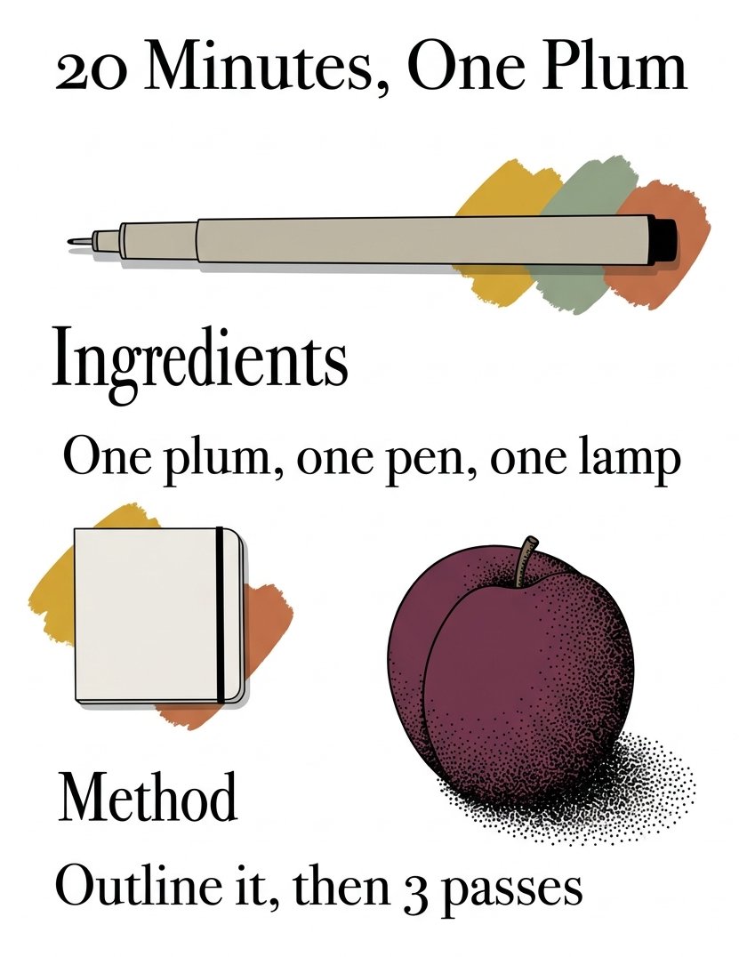
I keep a card propped by the lamp for these. It says 20 Minutes, One Plum. Ingredients: one plum, one pen, one lamp. Method: outline it, then 3 passes.
Then the small hard things that live in a drawer. A pebble is a flat oval with a bruise of dots under one end. A marble keeps one clean circle bare and crowds the rest. A button gets its dark in the 4 holes and nowhere else. A thimble is a grid of dents, each one a 3-dot cluster.
I do these when I cannot face choosing a subject.
The kitchen shelf is the most forgiving of the lot. A clove of garlic is papery, so keep the dots loose and let paper show through. A cork is all speckle already, so you are only copying. A slice of onion takes dots between the rings, never on them. A dried orange slice is dark between the segments and pale inside each one.
Filling the whole shape flattens it every time.
Then the things that come home in a coat pocket. A shell takes dots in the grooves only. An acorn cup is a crosshatch of tiny pits. A single pinecone scale is dark underneath and bare on top. A walnut is a map of ridges, and the dots go in the valleys.
Chasing every ridge is what kills a walnut. Do about half and stop.
Small metal things are a shortcut, because metal is contrast and nothing else. A key is bare along its spine and near-solid beside it. A teaspoon keeps one bright stripe completely untouched. A thumbprint is the pattern itself, dotted. A coffee ring is darker where the cup sat longest.
Leave the highlight bare. It is the only thing making it metal.
The last 4 are the ones I reach for when the day has been long. A pea pod takes 3 soft bumps of shade and nothing else. A moth wing is dotted along the veins. A single feather barb is one row of dots per side. An egg is the purest version of the whole idea.
(I have drawn the same egg more times than I would like to put in writing.)
Why do my dots look like a rash instead of a shadow?
Because they stopped too early, and because they are evenly spread.
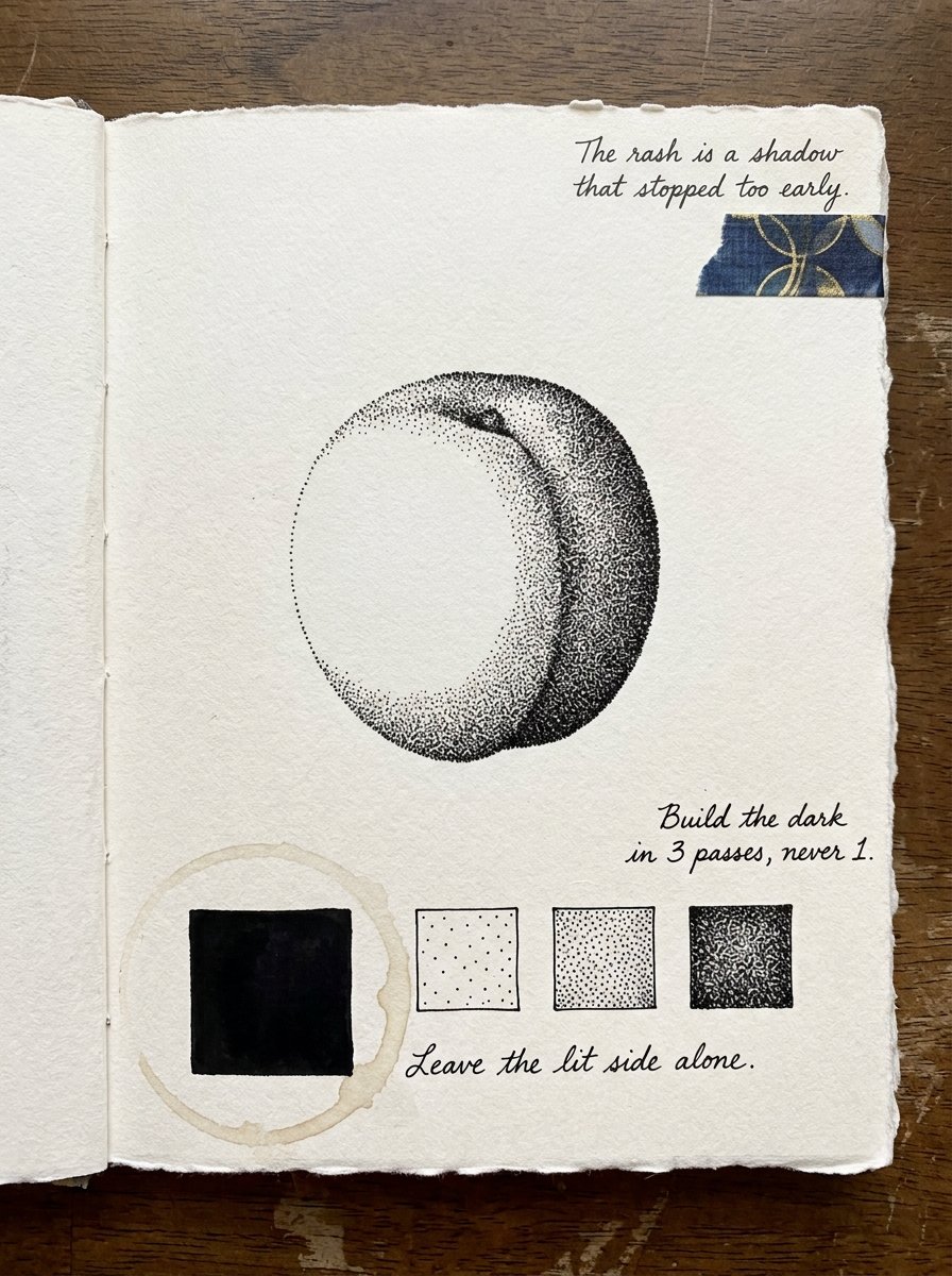
A rash is dots you can count. A shadow is dots that have run out of room. The gap between those two is not talent. It is about 3 more passes.
Most stippling drawing goes wrong right there, and it goes wrong early rather than badly.
In Venice in the early 1500s, an engraver called Giulio Campagnola wanted softer light. The painters around him were already getting it. Line work could not do it, because cross-hatching arrives as a mesh, and a mesh is visible.
So he cut his plates with flicks and dots instead. The Art Institute of Chicago holds his Woman Reclining in a Landscape from 1508. Its curators say he developed a method of engraving with flicks or dots, which produces subtle gradations of tone. They credit him with inventing the dotted manner outright.
He did not invent a texture. He invented a way of getting a shadow out of a tool that only made lines.
Which tells you what your rash is missing. It is not finer dots. It is more of them, in the places that are already darkest.
So build the dark in 3 passes, never 1. Lay a scatter over the whole shadow side first. Then go back and crowd only the darkest third. Then crowd the darkest third of that. Leave the lit side alone. (I have ruined more drawings by tidying the light than by any other move.)
Which stippling drawing ideas rescue a page that already went wrong?
These 24 are repairs. Dots are the only mark you can add to a finished drawing. They never argue with the lines already there.
Most rescues are about weight, not about the wobble. The ground behind a leaning stem takes a dotted wash and the stem stops leaning. A cast shadow under a floating object puts it back on the table. The base of a tree does the same job outdoors. The water under a boat is darkest where the hull meets it.
Put the dark where the thing touches the world. That is the whole trick.
Then the collisions, where two lines met badly and you cannot unmeet them. The gap between two petals goes solid dark and the collision disappears. The corner where three lines met takes a dense cluster. The seam where two washes met gets dots straddling it. A hem that wandered is fixed by darkening under it.
Dark hides a join. A second line only announces it.
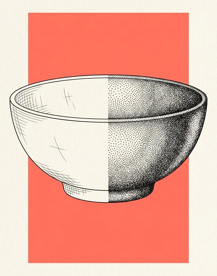
Some shapes go flat, and flat is a density problem. A bird’s breast wants dots under the curve and none on top. The far half of a bowl takes twice what the near half does. A pot that leans straightens up once one side is loaded. A moth’s body that went thin thickens with 2 dotted flanks.
I fix lopsided things by shading, not by rubbing out.
Then the holes, which are the commonest fault of all. A window that reads as a hole needs a graded inside. The inside of a mismatched jar takes dots down one wall. A shell’s opening goes darkest deepest in. The underside of a mushroom cap is a dotted fan.
An empty shape reads as a mistake. A graded one reads as a space.
The sky rescues are the quickest win here. A horizon that came out too pale takes a dotted gradient down to the line. A cloud that looks like a scribble is fixed by dotting the sky around it. A moon that came out flat needs one dotted side. The space between branches is what makes branches read at all.
Draw the gaps, not the thing. (This took me an embarrassingly long time to believe.)
The last 4 are the fiddly ones. The underside of a curled leaf is darkest in the curl. The dark side of a ribbon turns where the ribbon turns. A stem where it enters a jar goes dark at the waterline. A hand-drawn frame that went crooked is rescued by a dotted shadow on one side only.
Has anybody ever built a whole portrait out of dots on purpose?
Yes, and he did it with a hammer.
The Lutma family were goldsmiths in Amsterdam, and a goldsmith spends his working life hitting metal with a punch. Janus Lutma the younger took that habit to a printing plate.
He did not engrave his portraits. He punched them, dot by dot, with a punch and a hammer. The Art Institute of Chicago calls the result punched engraving, and holds his portrait of the poet Pieter Cornelisz. Hooft, made somewhere between 1669 and 1681.
An 18th-century hand wrote a note on the back of that sheet. He made only 4 prints this way, it says, and all 4 were prized. A whole technique, and a working life of 4 pictures.
He was not drawing at all. He was hitting a sheet of copper until a face came out of it.
The useful part is the rhythm. A punch lands one blow at a time, so the picture arrives at a speed you cannot hurry. Dots work the same way and that is a feature, not a cost.
So put on something long to listen to and stop trying to get there. (I time mine by the radio, which means every drawing is exactly one programme wide.)
Free Starter Pack
Get 10 free pattern templates for the shapes you have just dotted.
Sent tonight. Bold fills that sit next to a dotted shadow without arguing with it.
Unsubscribe in 1 click, no hard feelings
Which stippling drawing ideas make something look finished?
These 23 are for when it has to leave the house. A card, a gift, a frame, a thing somebody else will hold.
Borders do most of the work, and they need no drawing ability at all. A dotted rule under a name turns a card into stationery. A dotted border on a gift tag crowds at the corners and thins along the sides. A dotted oval around a single stem makes a specimen of it. A vignette corner fades out into bare paper.
A border ruins itself by staying even. Crowd the corners.
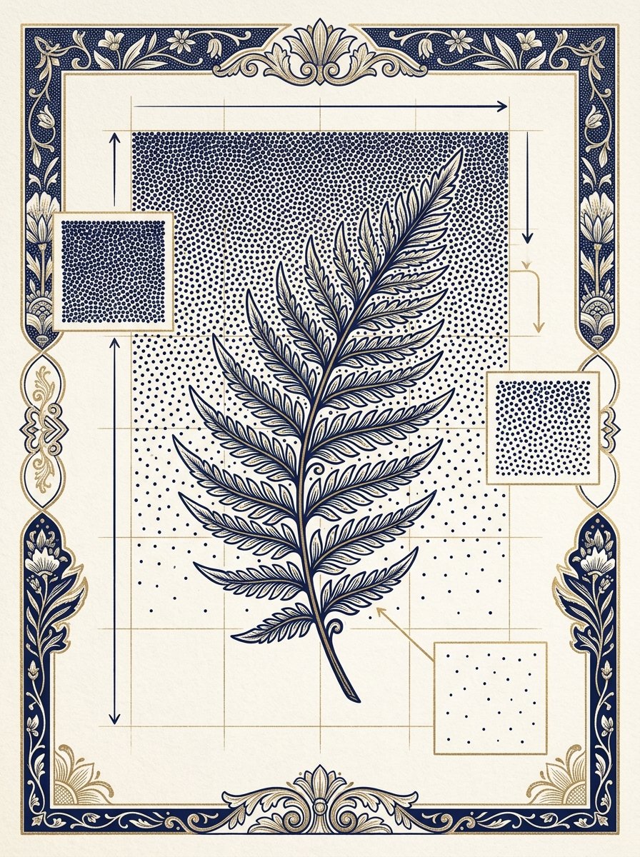
Then the backgrounds, which is where finished really comes from. A night sky behind a branch is dense at the top and thin at the bottom. A dotted ground behind a pressed fern lifts it off the page. A pale sea under a moon is dotted only where the light is not. A silhouette filled solid needs the paper around it left bare.
Background dark is what makes a thing look mounted.
Shadows are the fastest of these to add. A dotted drop shadow under a monogram takes 2 minutes. A wreath with dotted berries gets its weight from the berries alone. A house portrait with a dotted sky suddenly has weather. A jar label with a dotted edge looks printed.
One direction for every shadow on the page. I get this wrong whenever I stop and come back.
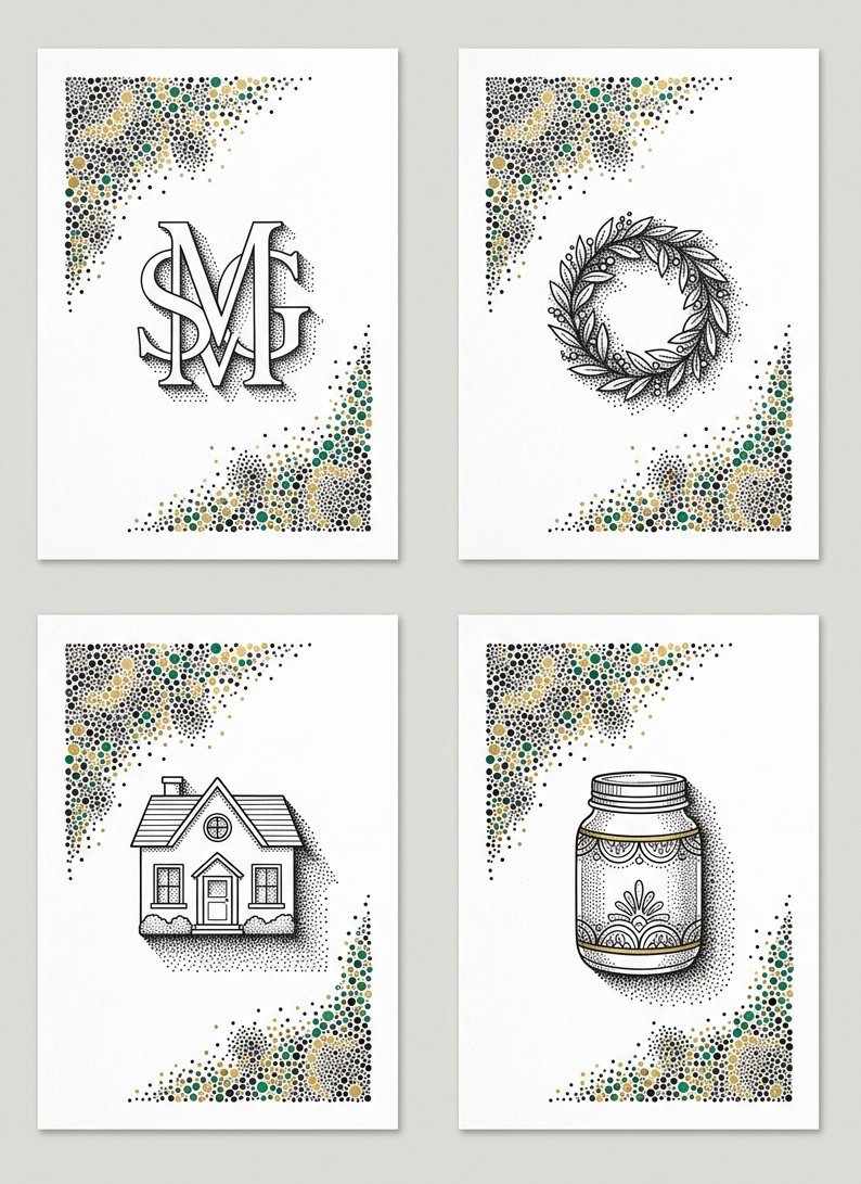
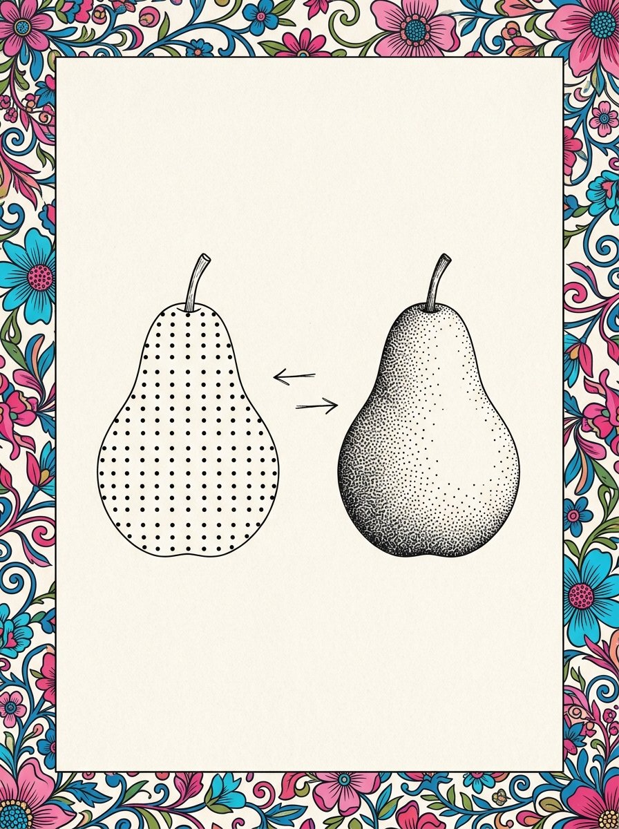
Then the ones that are genuinely gifts. A pet drawn with a dotted coat is the one subject here where density does the whole likeness. A bookplate wants a dotted ground and bare lettering. A botanical specimen with a dotted shadow reads as a plate from a book. A pear with a fully dotted background is the simplest framed thing on this list.
Every stippling drawing on this list is built the same way, and only the surround changes.
The last 7 are decisions rather than subjects. A dotted frame inside the frame adds a margin. A single bare highlight left on a dark shape is what sells it. A crowded base under everything grounds a whole page. A dotted horizon placed low makes a small drawing feel wide.
One solid black area beside all that grey gives the eye somewhere to rest. An untouched half is a legitimate finish. A signature in dots is the last one, and the only place I allow myself to be fussy.
When do I stop adding dots?
Later than you think. Almost always later than you think.
This is the part of stippling drawing that nobody demonstrates, because it is boring to watch.
Vija Celmins, born in 1938, has spent decades on exactly this question. She draws night skies, ocean surfaces and desert floors. She builds them from marks so small and so many that they stop reading as marks.
Her Night Sky #15 took from 2000 to 2001. One picture, 31 inches across, and most of it is dark.
She has said that if there is any meaning in art, it resides in the physical presence of a work. Which is a working instruction as much as a belief. The thing on the paper is the thing, and it only gets there by being built.
A stippling drawing is not finished when the shape is right. It is finished when the dots have stopped being dots.
So the test is a step backwards, not a closer look. Stand up, walk to the door, and turn round. If you can see individual dots from there, it is not a shadow yet.
Then go back and crowd the darkest third again. The fills in the pattern guide pick up exactly where the dots put you down.
How do I use the free dot value chart tonight?
The chart is the short version of all 71 stippling drawing ideas. It is 5 squares, one pen, and the same hand doing more of the same thing in each one.
Print it, then draw a small shape beside it. Anything with a clear lit side will do.
Now decide which square on the chart your darkest area should match. Work up to it in 3 passes and check against the chart between each one.
Most beginners land on Scattered and stop. The drawings that look finished have gone to Crowded and left Bare paper untouched right next to it.
That contrast is the entire effect. Not the dots. The distance between the crowded part and the bare part.
I keep my first chart taped inside a cupboard door. It has a plum on it, drawn badly. Beside it a note says the rash is a shadow that stopped too early.
A chart is one evening. The 100 Collection is what happens after it. 100 flowing-line pieces across 10 themed sets, each with a 5-step draw-along and a faint trace guide. Every one of them has a dark side you can now build.
100 pieces to dot, and 10 themed sets to work your way through
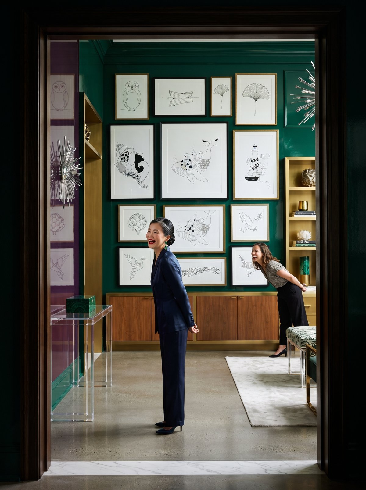
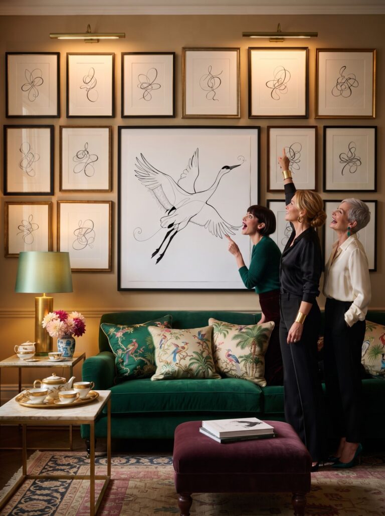
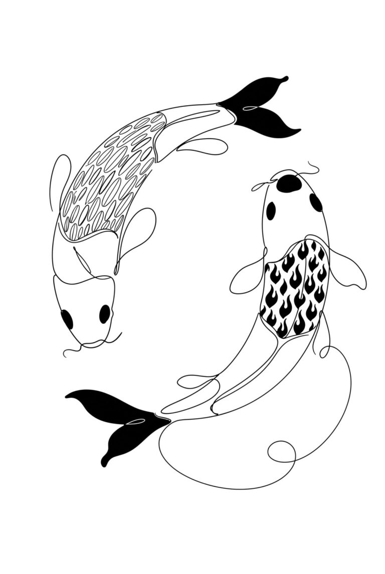
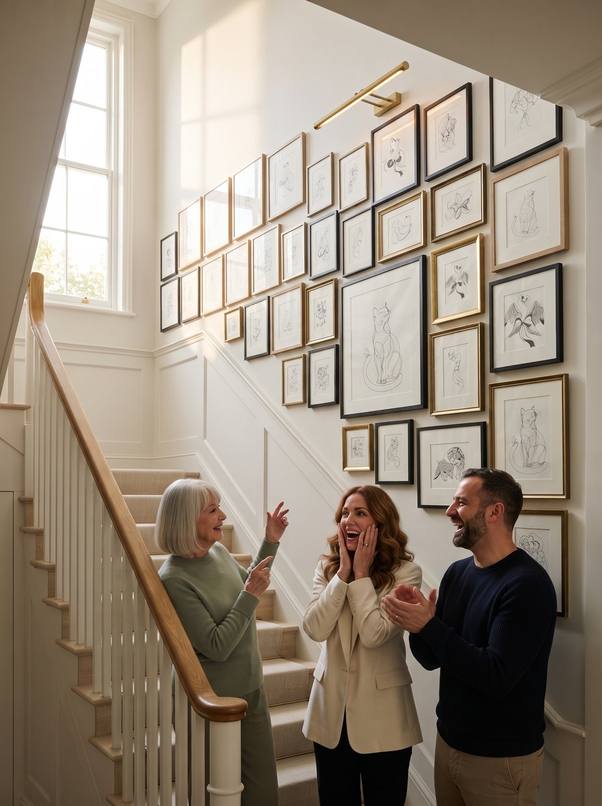
Pick a title tonight and dot its shadow side. The draw-along breaks each piece into 5 steps. Print the faint trace if the day has been long, or work freehand on plain paper. I do both. The freehand ones are the ones I end up framing.
Instant download · print as often as you like
A dot is too small to be a mistake. Put down enough of them and the dark arrives on its own. It never once asks whether you can draw.
“I believe if there is any meaning in art, it resides in the physical presence of a work.”
Vija Celmins
Mirabelle wrote this. No training, strong opinions, many pens. Peer reviewed by a cat who sat on the dotted half and left a paw-shaped gap.