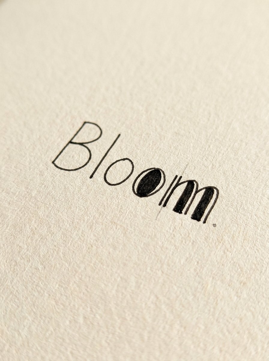
A thick downstroke is the whole of calligraphy, and a 20p biro can fake every one of them. That is what faux calligraphy is.
Look closely at any brush-pen letter. The fat part has two edges and a middle. Somebody filled that middle in. A brush does it by squashing. A pen does it by outlining.
That is faux calligraphy, and it works with whatever pen is nearest.
(I tested it on a free biro from a hotel. The biro was fine. I was the problem, briefly.)
Below: the free practice sheet, and 7 steps from a plain word to a thick-and-thin one. Then three moods built from the same letters, and 2 questions people actually ask.
Download the free practice sheet →

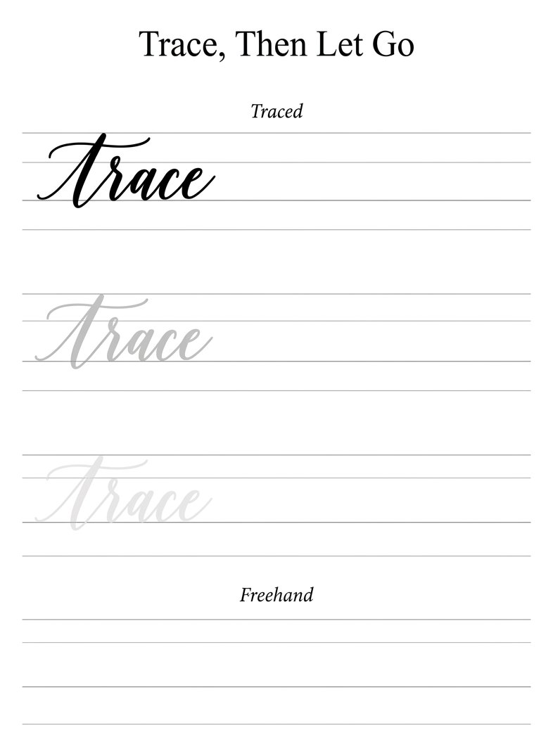
The sheet carries one word, printed three times. The first is plain. The second shows where the weight goes. The third is filled.
You trace the first. You copy the second. You do the third alone.
Nothing on that page needs a special nib. A gel pen works. A pencil works, and rubs out, which is the whole argument for a pencil.
Here is the part nobody says out loud. The trick takes about 20 minutes to learn. After that the trick is no longer the problem. The problem is the letter underneath it.
A thickened stroke makes a good letter better. It also makes a lopsided letter a lopsided letter with weight. I have proved this on my own kitchen table more than once.
So the skill splits in two. The thickening is mechanical, and you will own it tonight. The shape of the letter is a decision. A decision is easier when somebody has already drawn a beautiful version for you to steal from.
That split is why the first evening goes well and the second one stalls. The move works immediately. Then you look at the word and something is off, and it is never the thickening. It is the skeleton underneath, which you wrote at speed, without deciding anything.
The Collection
So what does the letter look like when somebody has already done the hard thinking?
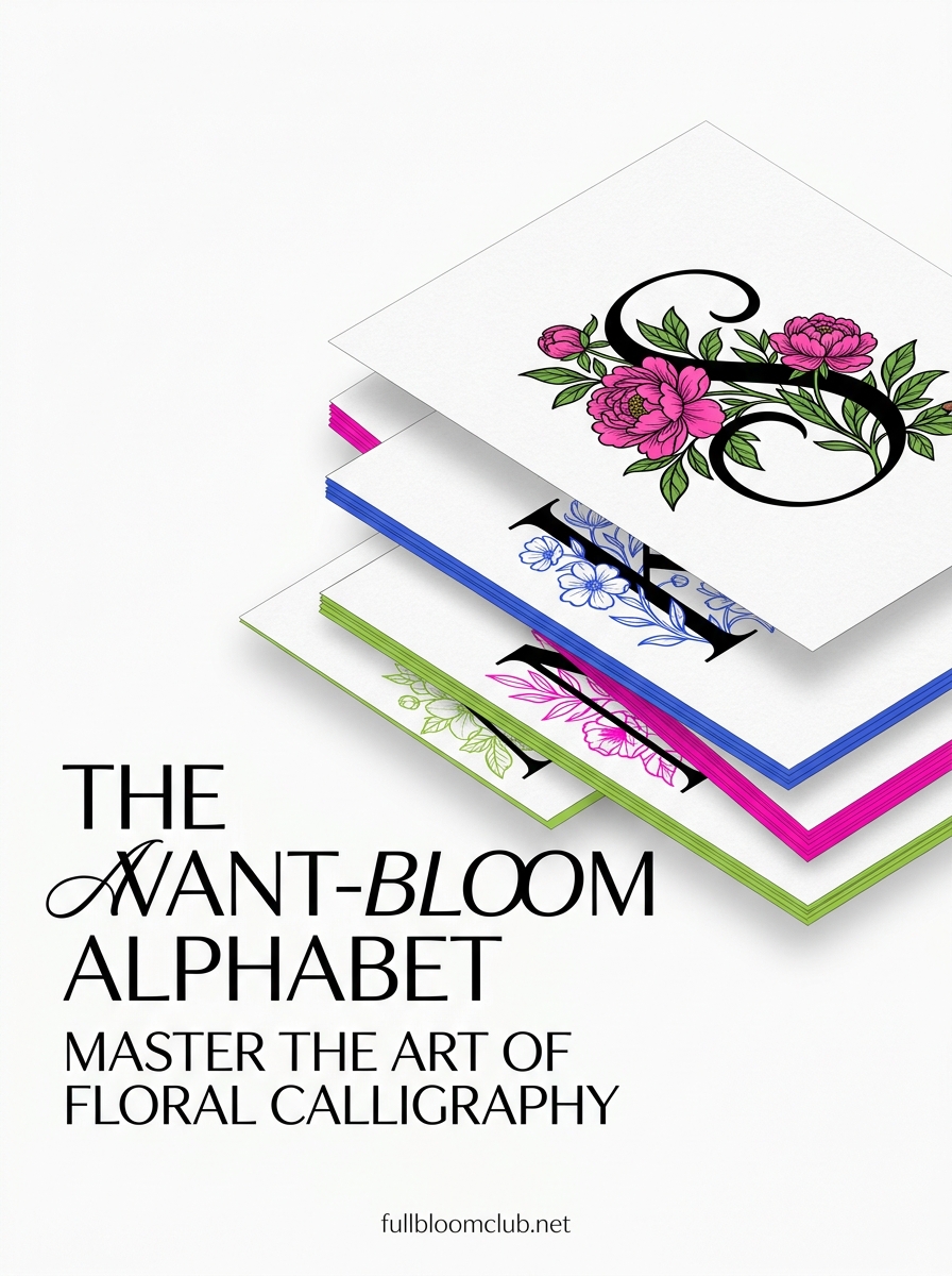
THE AVANT-BLOOM ALPHABET. Peonies, anemones, and one Z that will not sit down. Inside: 26 letters, A to Z, each built in three stages — the skeleton, the dress, the finale. For the evening you want your own initial on the wall and no argument about it. What you get: a letter worth thickening tonight, and 25 more behind it.
Steal the skeleton, then do the rest yourself. That is the order. Start with a word you already write without thinking.
Step 1 — Write the word once, in your ordinary handwriting
Write it joined up, in one go, at about twice your normal size.
Do not letter it. Do not slow down. Joined handwriting already has the loops and crossings that make faux calligraphy look expensive. It has them because your hand made them, not because you planned them.
Big matters more than neat. A small word leaves no room inside the stroke, and the stroke is where all the work happens.
(My first attempt is always cramped. Every single time. I now write the first one deliberately too large, as a tax.)
Look at what you have. It is one weight the whole way through. That is monoline. Monoline is not a failure. It is the skeleton, and every step after this hangs on it.
Step 2 — Find every stroke where the pen came towards you
Only some strokes get thicker. Picking the right ones is the whole illusion.
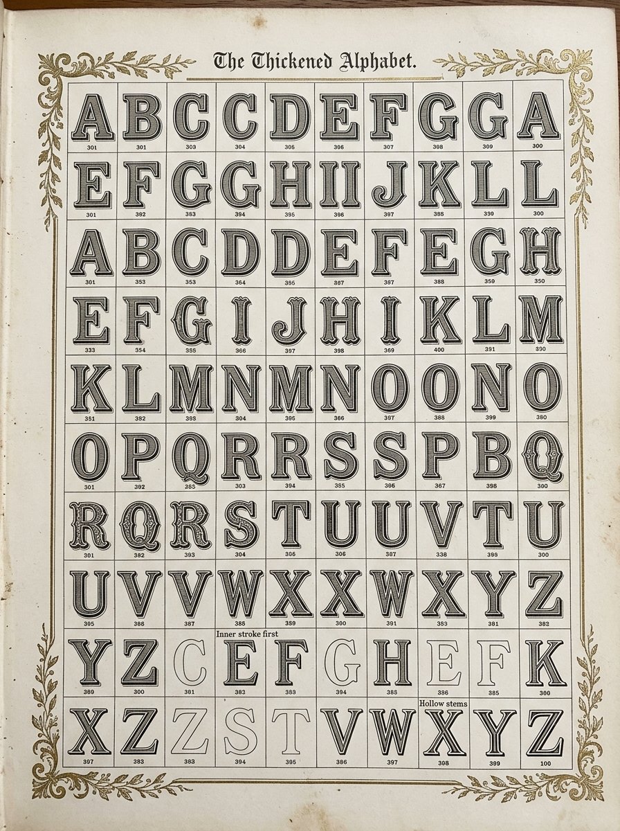
The rule is short. A stroke gets weight when the pen travels down the page, towards your body. Up strokes stay thin. Sideways strokes stay thin.
Say it while you point at the word: down thick, up thin.
Mark the downstrokes with a light dot. Actually mark them. Reading the word and deciding in your head is a different task, and the hand disagrees with the head at speed.
(I skipped the dots for a fortnight. My words came out thick in random places, like a signal going in and out.)
In a lowercase letter the downstroke is usually the tall straight part and the front of any bowl. In a capital it is usually the spine.
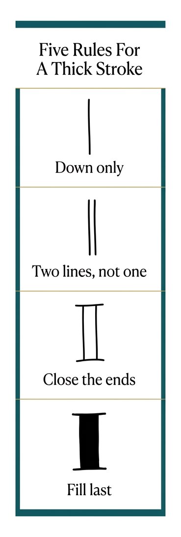
Step 3 — The faux calligraphy move: a second line beside each downstroke
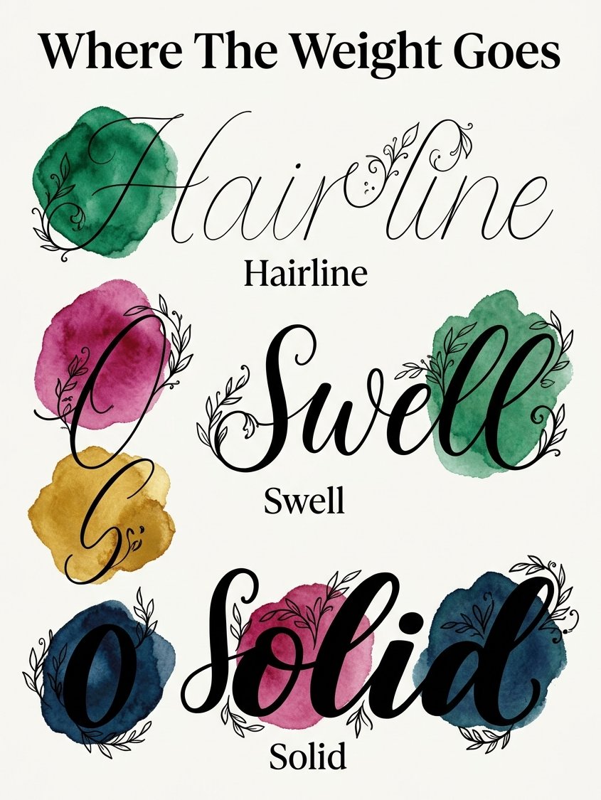
Here is the actual move of faux calligraphy. You are not pressing harder. You are drawing a narrow shape.
Pick a side and stay on it for the whole word. Left of every downstroke, or right of every downstroke. Never both, and never alternating.
Keep the new line roughly a pen-width away. Keep that gap the same the whole way down.
The gap is the thickness. You decide how bold the word will be before a drop of ink goes inside it.
Run the second line slowly. This is the one line that rewards going slowly. The eye reads the outside edge of a letter and forgives almost everything else.
(Mine wanders outward near the bottom. I have accepted this about myself.)
Step 4 — Close the gap at the top and the bottom
You now have two lines with an open shape between them. It looks unfinished because it is.
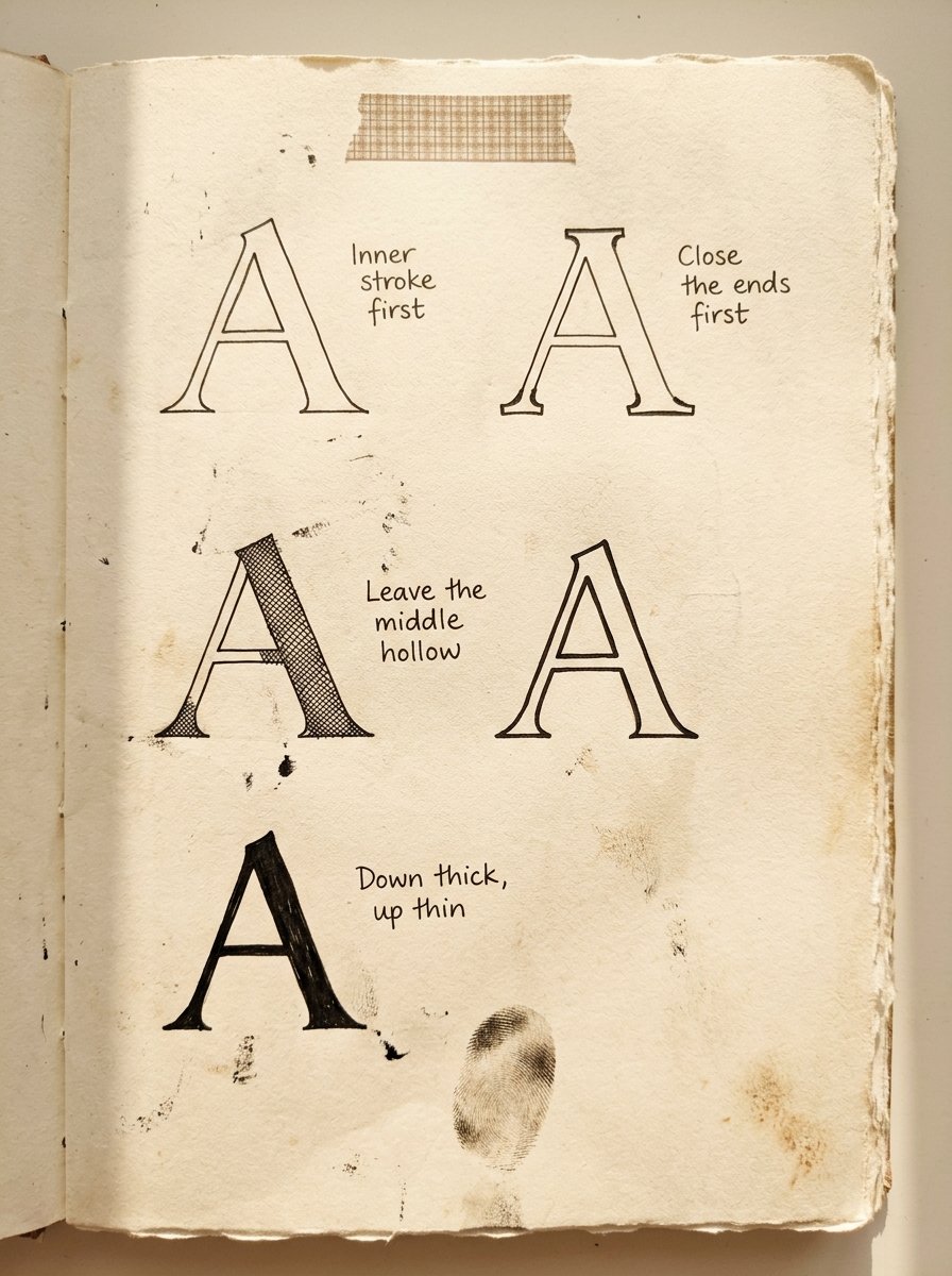
Cap each end with a short stroke straight across. Two tiny lines, top and bottom. The shape becomes a closed container.
The ends decide the character. Flat caps read modern. A slight curve reads softer. A point reads like a brush lifting off.
Close the ends before you fill anything. An open-ended stroke filled with ink bleeds into the letter beside it, and the word turns into a hedge.
(I have made the hedge. Twice. On a card that then had to become a different card.)
This is also the moment the word stops looking like handwriting with a mistake on it.
Step 5 — Fill the faux calligraphy stroke, inner edge first
This is the step where people put the pen down, and it is worth knowing why.
Edward Johnston wrote the manual on this in 1906, and he had a name for exactly what you are doing. He called them built-up letters. Built-up letters are composed of compound strokes. Simple-written letters are composed of simple strokes.
He was blunt about why a pen needs them at all. To produce thick strokes, a building-up process is required.
Then, on page 253, he gives away the tip that fixes most beginner pages. The inner strokes should generally be made first.
So fill from the inside edge outwards, not from the outline inwards. The inner line makes the counter, the white hole inside a b or an o. Get the inside right and the outside can wobble unpunished.
Johnston has one more that nobody expects. On very large letters he leaves the middle hollow on purpose, to stop the stem looking heavy.
You are allowed to do that tonight. A thick stroke outlined and left empty is a finished look, not an unfinished one.
(I filled 11 before one looked right. The 12th was hollow, and it was the best of them.)
Step 6 — Three moods from the same letters, without redrawing a thing
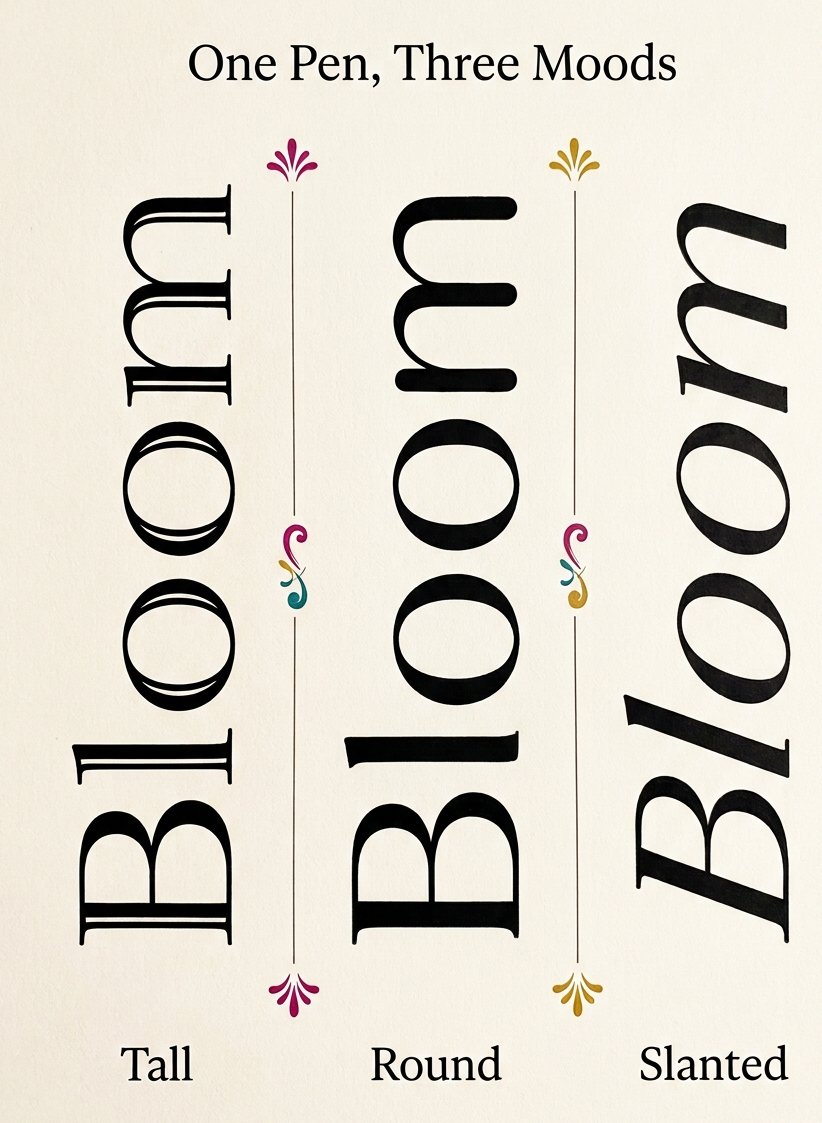
Nothing below changes your handwriting. Each one changes a single setting.
Tall: keep the gap narrow and stretch the word upward. It reads elegant, and slightly formal.
Round: widen the gap and let the caps curve. It reads warm, and it suits a name on a parcel.
Slanted: tip the whole word to the right before you thicken anything. It reads fast.
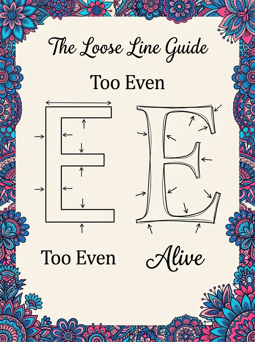
W. A. Dwiggins is the reason I trust this. He cut his letters out of celluloid stencils, and he cut them badly on purpose. The inner curve and the outer curve of a stroke were deliberately mismatched, so the shape refuses to sit still.
He drew Metro in 1929, Electra in 1935 and Caledonia in 1938 that way.
The habit came from his other job. He built two marionette theatres, most of the puppets about 12 inches tall. A puppet with two identical halves stops reading as alive from the seats.
Same instruction for your word. Let the inner and outer edge disagree slightly. A stroke with two identical edges reads like it was printed, and nobody frames a printout.
If you want more letter shapes to borrow from, our hand lettering guide has 59 of them.
Step 7 — Where faux calligraphy wobbles, and what each wobble is telling you
Four things go wrong. Each has a different cause, and none of them is your hand.
The word looks stripey. You thickened up strokes as well as down strokes. Go back to the dots.
The thick parts are different widths. You changed sides partway through. Pick one side and hold it.
It looks blotchy. You filled before closing the ends, or you filled the outline before the inner edge.
It looks stiff. Your two edges are perfectly parallel. That is the Dwiggins problem, and the fix is to let them drift.
(I keep a ruined page in the drawer with all four faults on it. It is the most useful page I own, and it is genuinely awful.)
Practising faux calligraphy without it feeling like practice
Trace, then let go. That is the whole method on the fade sheet.
The word is printed solid, then paler, then paler again, then not at all. You go over the dark ones first.
By the time the page runs out you are doing it alone, and you did not notice the handover.
(This is the only kind of practice I actually finish, because it never announces itself as practice.)
Free Starter Pack
10 pattern templates for the marks that go inside a thick stroke.
Sent tonight. Small fills for the hollow part of a letter.
Unsubscribe in 1 click, no hard feelings
Faux calligraphy vs brush calligraphy: which one am I actually doing?
Brush calligraphy makes the thick stroke in one pass, by pressure, with a flexible tip.
Faux calligraphy makes the same shape in three passes, with anything.
The finished letters are hard to tell apart on paper. The difference is entirely in how the weight arrived.
One is a physical skill that wants the right tool and a few weeks. The other is a drawing decision you can make tonight with a biro.
There is one practical difference worth knowing. A brush pen commits the moment it touches the paper. An outline does not commit until you fill it. You can change the weight of a word after you have written it.
(I do both. I reach for the biro more often, and I have stopped feeling odd about that.)
Do capital letters get the same treatment?
Yes, with one change. A capital has a spine, and the spine is the downstroke.
On A, the left leg stays thin and the right leg takes the weight. On N, the two uprights stay thin and the diagonal gets it. On O, the weight sits on the left curve and thins at the top and the bottom.
Johnston helps here too. He noticed a stem looks better slightly wider at the head than at the foot.
(I ignored that for years. It is the cheapest thing on this page.)
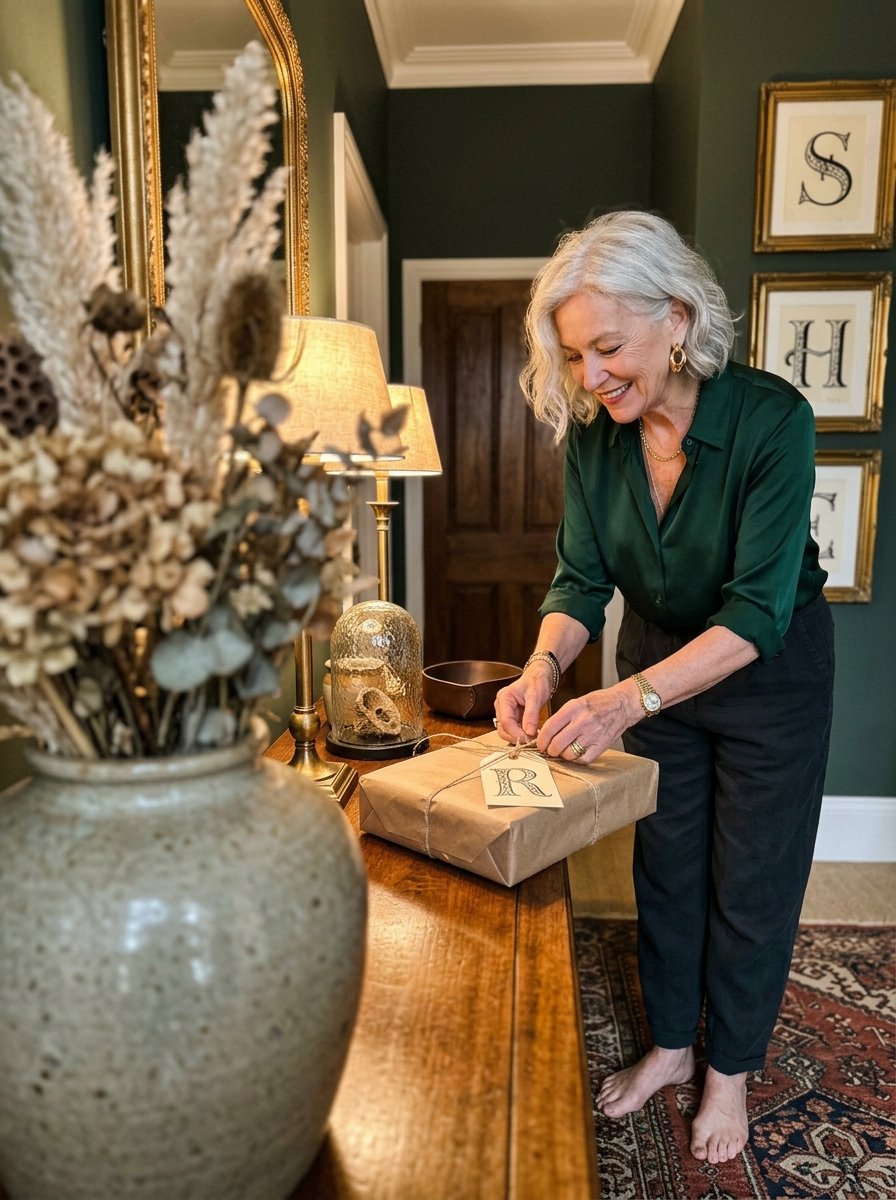
One letter on a tag is a whole evening, and it leaves the house in the morning.
26 letters, A to Z, drawn and ready to thicken
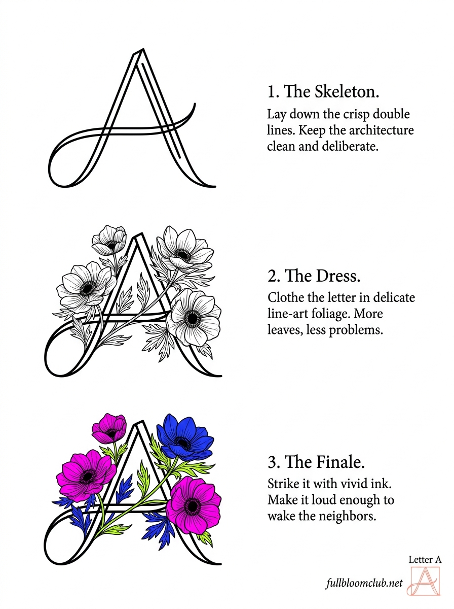
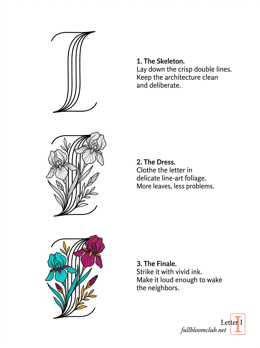
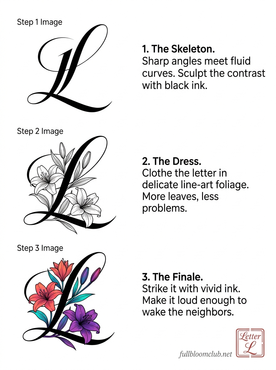
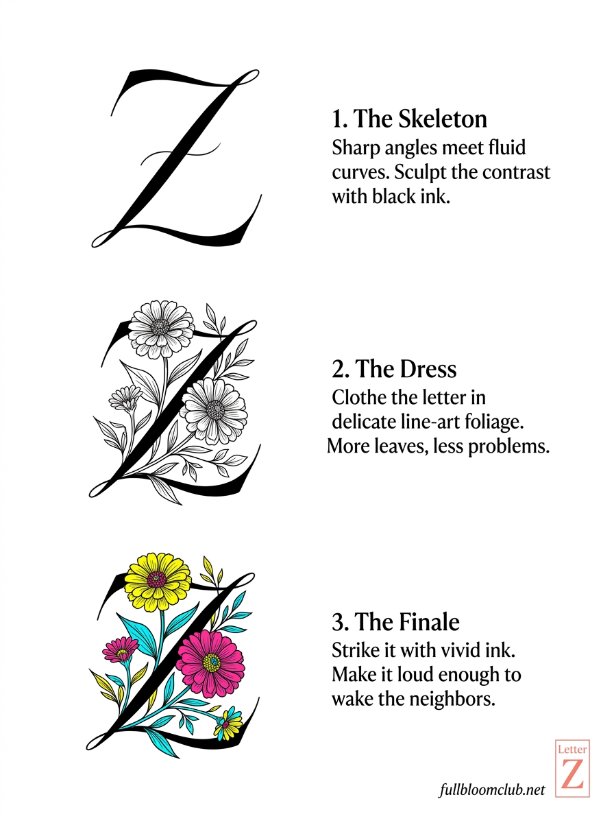
Inside: 26 floral letters, each one already beautiful before you thicken it.
Open The Avant-Bloom Alphabet →
Instant download · print as often as you like
Every thick stroke on a page is a place where somebody slowed down on purpose. Paper keeps that. It is very good at remembering an unhurried evening, and it never once asks what the word was for.
Mirabelle wrote this. No training, strong opinions, many pens. Peer reviewed by a cat who sat on the alphabet and flattened the R.